Intro

Meet Chit-Chat

The operational chat is a closed military messaging platform that constitutes a huge part of IDF communication between different units and individuals.
The application, which operates on the "Red" military cell phone and on stationary positions, allows operational processes to be easily simplified through encrypted messages.
Due to the operational nature of the system, identifying details such as logo and name have been changed and classified texts have been censored.

Role

UX/UI designer and researcher
• 12 Developers
• 1 Project manager
• 1 Analyst
• 3 QA

Process

• Discovery & research
• Ideation
• Testing
• Design
• Final Takeaway

Tools

• Figma/Figjam
• Adobe creative suite
• Trello
• Jira
• Google meet
• Google workspace

Duration

10 months +

Purpose

Accessible communication everywhere

The goal of the operational chat is first and foremost to provide a closed and efficient communication solution to all forces deployed in the field and at headquarters.
The main function of the chat is to enable uniform communication between different forces, different units, and more.

Crafting The Personas

Who Are The Main Users?

We created different personas whose demographics, motivations, goals, and frustrations represent the needs of the end user. These personas, each of which embodied typical user goals and needs, highlighted potential problem areas that allow for improvement in user experience.

Creative thinking

Challenges along the way

Challenges that arose during work on the system -

Accessibility and simplification

A significant portion of users are reserve personnel who do not work with the system on a daily basis. Therefore, it is necessary to think about how to make newly implemented features accessible to new and returning users.

Creating a single language

The system was built in a hasty manner and not closed by mandatory and permanent servants. Therefore, no single, consistent design language was defined, which resulted in different behaviors among identical components.

Responsive design

The military operates several types of computer monitors of different sizes and resolutions.

The problem

Fragmented and unsafe communication ecosystem

Operational communication in the field relies on fragmented tools that lack security, context continuity, and multi-channel visibility.
Users such as intelligence officers, command center operators, and reservists face information overload, classification challenges, and delayed response times.
Existing chat systems are not optimized for compartmentalization, real-time prioritization, or mission-critical environments.

The solution

Secure, context-aware operational chat platform

I designed a classified operational chat platform tailored to military communication needs, combining real-time collaboration, secure information flow, and situational awareness in a single interface. Key innovations like Multi-Channel Split View, Priority Tagging, and Reserve Refresh Mode enable users to stay updated across multiple channels without confusion or data leakage.
The system balances speed, clarity, and security, allowing teams to act confidently under pressure while maintaining strict operational protocols.

Highlights through the process

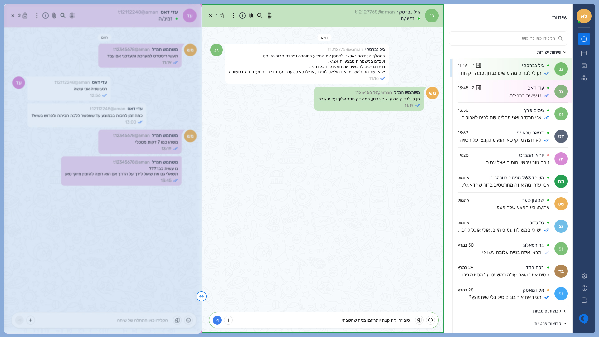
With the help of product managers and team leads, I was able to create, test, build
and characterize both the responsive web app and the native mobile app.

Meetings

 We built strong trusting relationships with the development team, who helped us connect to external customers and internal field service engineers. We set up weekly calls where we learned more about the domain and functionality while also validating our designs as we went.

Usability issues

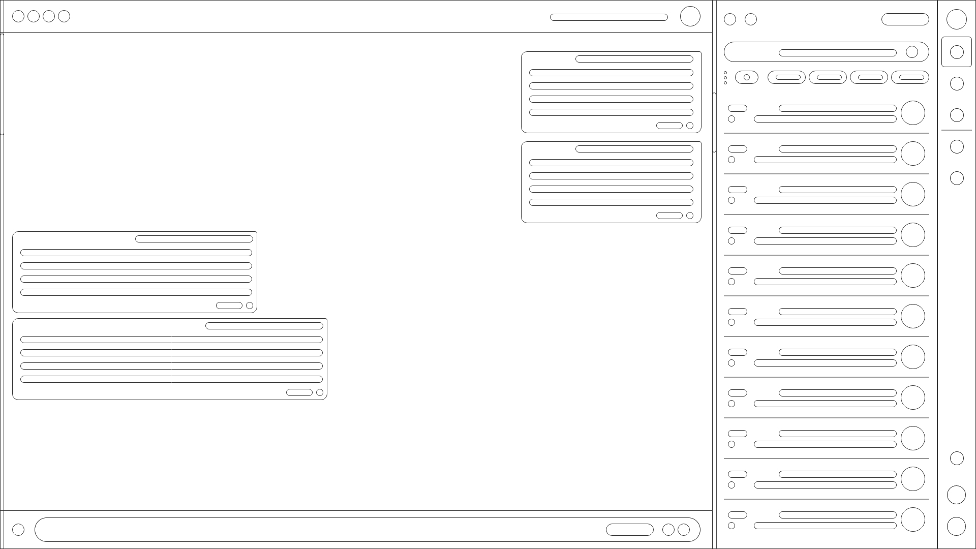
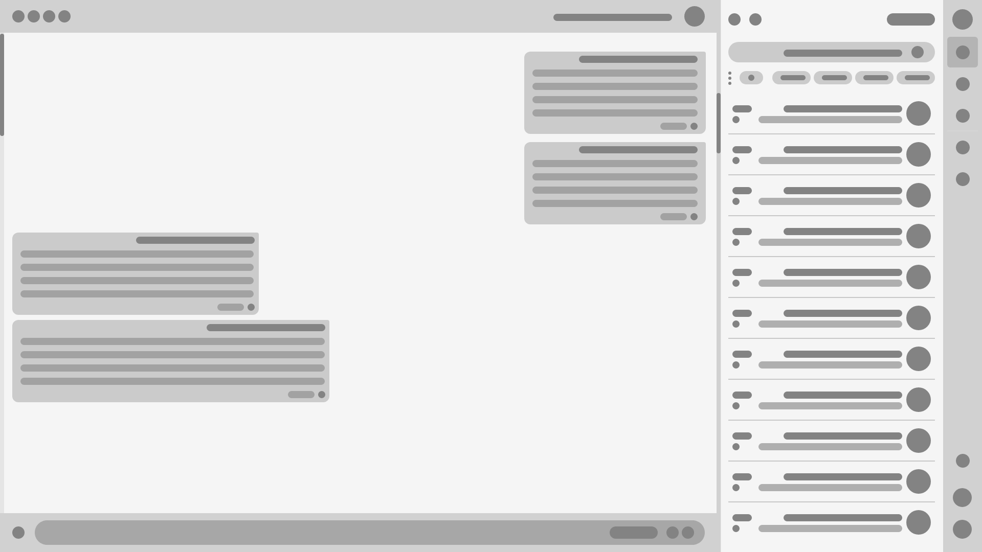
Since we had to be conservative with layout changes and we had to be mindful of the deadline, I decided to focus most of my “redesign energy” on the main usability problems of the most frequently used areas of the system.

Testing

We had many rounds of user testing to validate those UI improvements.

Mid-sprint reviews

We also set up a mid-sprint design review. We did this because design feedback during sprint demos snowballed the JIRA tasks into the next sprint. Having a design review mid-sprint allows for a wider scope of revisions with at least 5 days to fix them, this helped us stay on track with design throughout the project.

Collaboration

Throughout the process, I collaborated closely with developers, researchers, and product managers to ensure design feasibility and consistency. This alignment between disciplines helped streamline decision-making and maintain a shared vision from concept to delivery.

Competitive analysis

Unlike WhatsApp or Signal, which focus on casual messaging, this platform is built for secure, structured, and mission-driven communication, combining real-time chat, role-based access, and operational control tailored to military needs.

Before and after home screen

The redesigned home screen simplifies navigation and enhances clarity.
I improved hierarchy, reduced white spacing and icon consistency, creating a cleaner, faster, and more intuitive interface that supports real-time decision-making and aligns with the system’s professional, mission-driven tone.

After
Before

A Little Extra

I received the system as a ready-made product.
Among the biggest challenges were re-characterizing existing screens and adding new screens without disrupting the daily operation of the system.
Each new feature was implemented gradually so as not to shock users.

Structure

Wireframes sketch

Main screens

Here are some of the intended screens for the operational Chat.
Among them were also user requirements such as dividing chats into group,
multi-channel split view, secure lens, reserve refresh mode and more.

Chat frame is colored in color for quick identification

Draggable button for frame resizing

Multi-Channel Split View

Watch 2-4 channels simultaneously. Option to freeze one channel while the other is updating. Especially optimized for "hamal" users and multi-group communication.
Chats can be organized through drag and release

Chat frame blurred

Secure lens mode (quick hide)

One click - blurs all content on the screen, to restore privacy in a physical environment. Automatic mode that activates after a period of inactivity.
Return to active chat by pressing the "unblur" icon on the left header inside the chat frame.

Dialog with first stage automatic replies

Chat with the service bot

Clicking the bot button brings up a dialogue with an automatic response

Live demonstration

Reserve refresh mode

For reservists returning after a break – a smart summary of everything they missed in the relevant channels. Daily/weekly summary with key points, decisions made, and important files. “Continue where you left off” option to restore operational context.

Design system

A design system is a set of standards for managing design at scale. It reduces redundancy while creating a shared language and visual consistency across different pages and channels.
This involved creating a comprehensive style guide that outlined color palettes, typography, iconography, and other visual elements.

By defining consistent design patterns and guidelines, I ensured that every aspect of the platform maintained a unified and polished look.

Take aways

This was the second major project I took part in as a lead designer. Unlike my previous role, this time I joined an existing, fully operational system with active users in real time. Instead of building from scratch, my challenge was to integrate new features, optimize user flows, and enhance the visual and functional experience—all while maintaining operational continuity.

This required a deep understanding of users' real-world pain points, motivations, and goals within the constraints of military communication. I learned to rely heavily on structured UX research, including affinity mapping, surveys, and user journey analysis, to guide design decisions with confidence.

Beyond the design work itself, this project was also my first experience collaborating with a large multidisciplinary team and a highly coherent product manager under the intense pace and uncertainty of a wartime reality. It taught me the importance of adaptability, clear communication, and prioritization—ensuring that even under pressure, design remained user-centered and strategically aligned with mission goals.

Also, given my prior knowledge as a graphic designer, I enjoyed designing several illustrations and modals at the request of the PM between assignments.

Example of dialogs created specifically for system changes -

Dark Mode

Comfort above all

Research shows that an app with a dark palette uses almost 90% less energy than a light palette.
According to user analysis we conducted, most users prefer to run the system in dark mode rather than light mode.