Keep is a dating platform app suitable for everyone that wants to find any connection.
Keep is allowing users to fully experience the app and
enjoy everything it has to offer, giving the user a real and honest option to meet people and develop any relevant connections.
Role
Lead UX/UI designer and Researcher
• 3 Developers
• 1 Project manager
• 2 Designers
Process
• Project kick-off
• Discovery & research
• Ideation
• Design
• Testing
• Design
• Final Takeaway
Tools
• Figma/Figjam
• Adobe creative suite
• Jira
• Zoom
• Google workspace
Duration
18 months +
General Idea
What Is It Exactly?
The dating apps in the market are very greedy and don't come towards the user, by limiting features, setting disproportionately expensive monthly subscription prices, and much more.
We believe that the network is the new matchmaker.
Keep revolves around the user and his needs and not the other way around.
We're just finding the match, the rest is up to you.
After
Before
The challange
Understanding why users adopt or abandon dating apps, and uncovering the motivations that drive their decision to stay engaged.
The objective
Designing a solution that improves user trust, engagement, and satisfaction while also meeting business goals.
The scope
Researching current user behaviors, pain points, and competitive gaps to shape the product direction.
Project kick-off
I used the Kick-off as an opportunity to gather team members and address any questions or clarifications before diving into the design process. It provided a platform for open discussions, allowing team members to seek clarity, share insights, and align their understanding of the project.
This agile approach ensured a smooth transition into the project and set the stage for a focused and collaborative design journey.
The challenge - Understanding why users adopt or abandon dating apps.
The objective - Designing a solution that improves user trust, engagement, and satisfaction while also meeting business goals.
The scope - Researching current user behaviors, pain points, and competitive gaps to shape the product direction.
Finding #1
Trust & Safety Are Critical Barriers
Finding #2
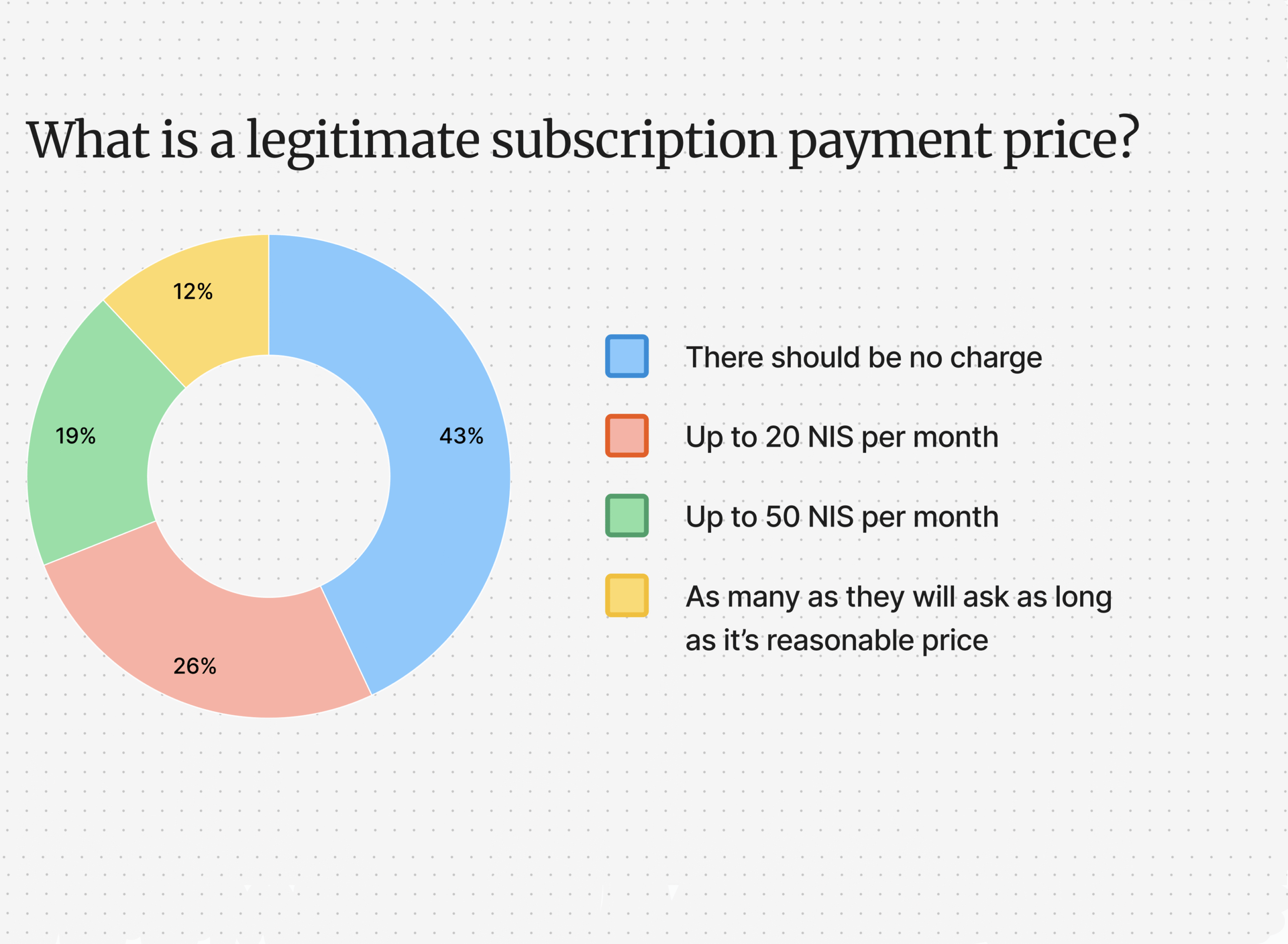
Cost vs. Value Misalignment
Finding #3
User Goals Are Diverse,
Not Just Hookups
Discovery and Research
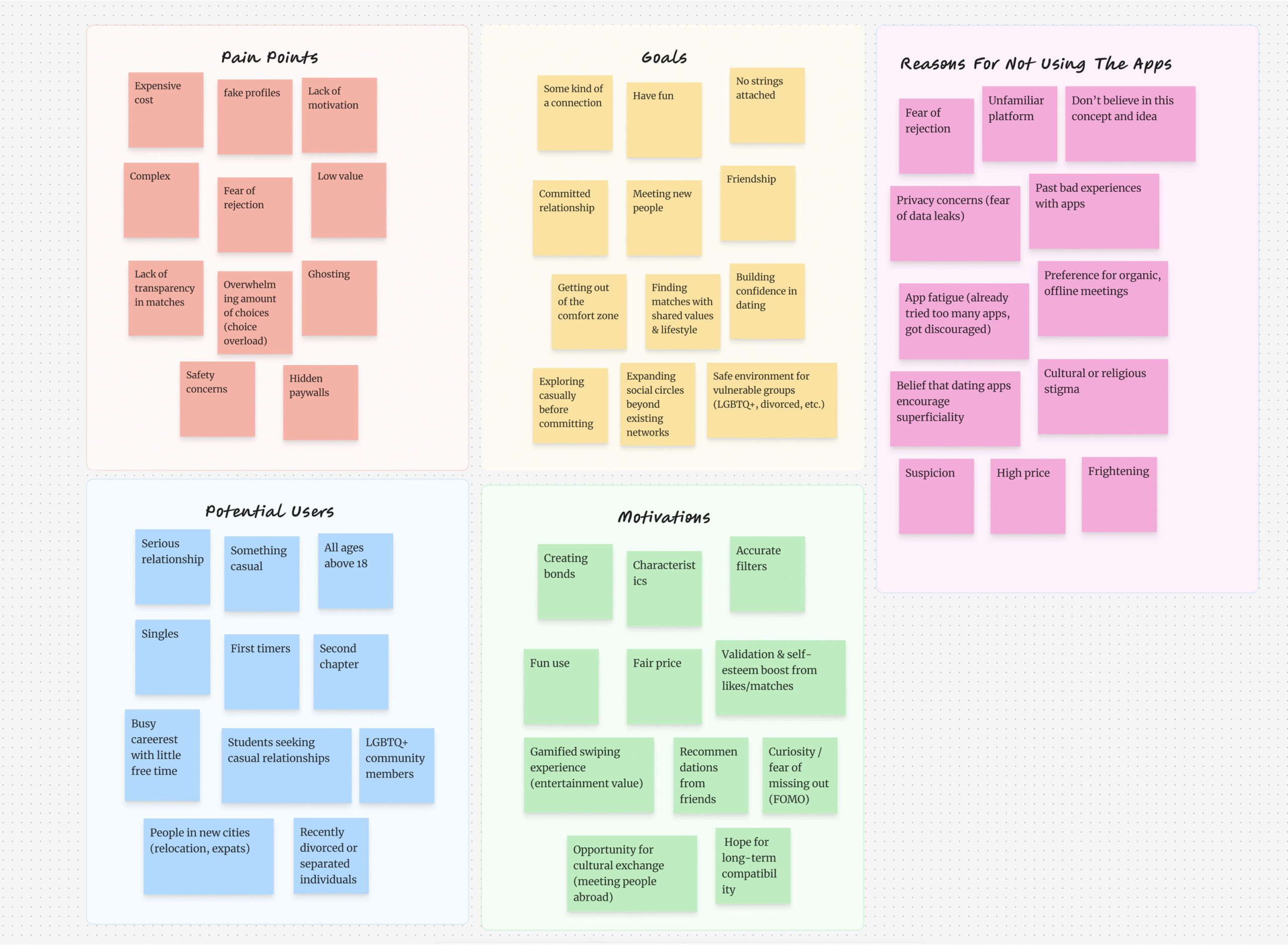
Understanding the users
We created different personas whose demographics, motivations, goals, and frustrations represent the needs of the user. These personas, each of which embodied typical user goals and needs, highlighted potential problem areas that allow for improvement in user experience.
Competitive Analysis
We checked out other similar platforms and read their customer reviews. This helped us identify some drawbacks in the existing solutions and opportunities for a better user experience.
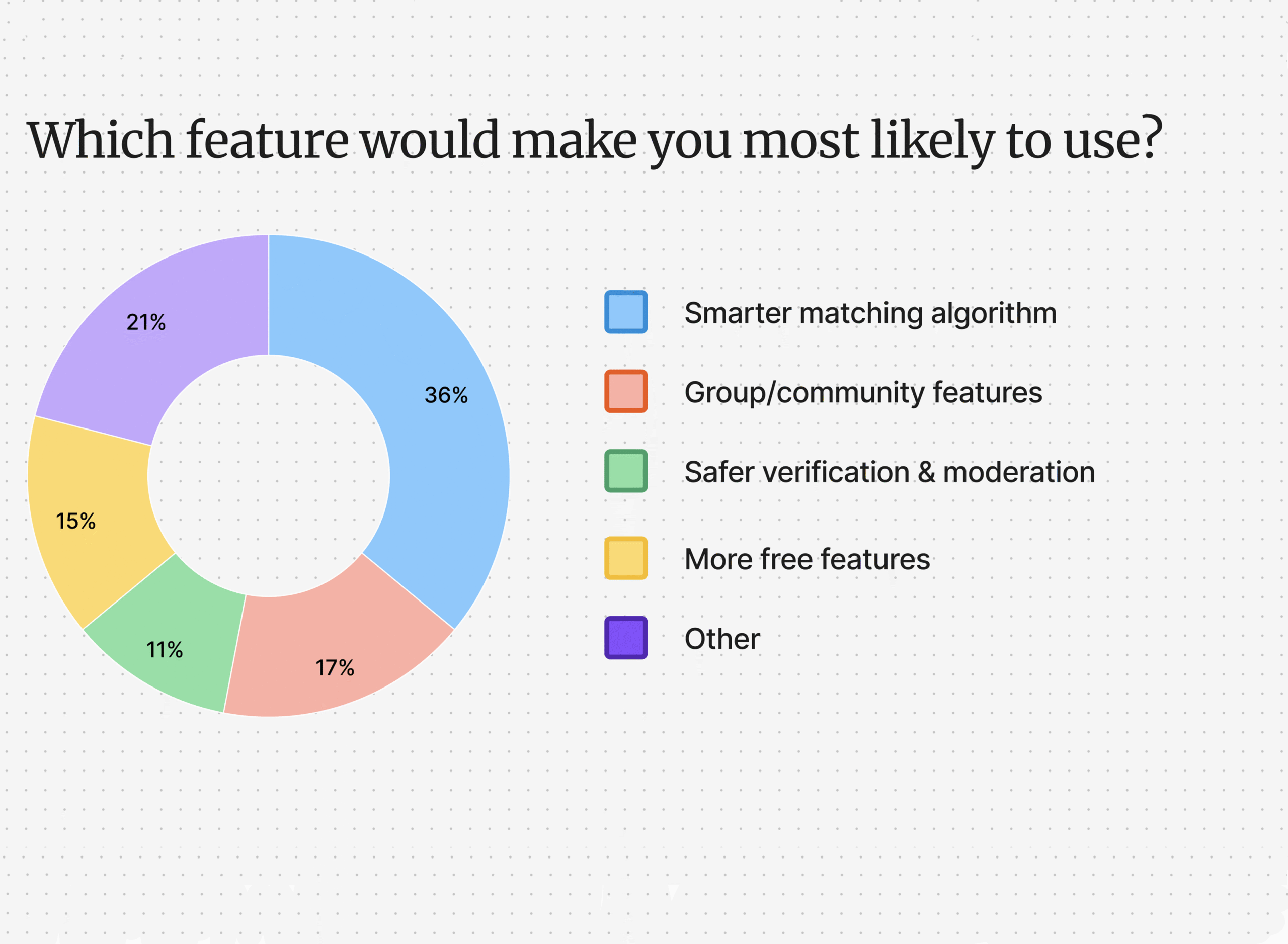
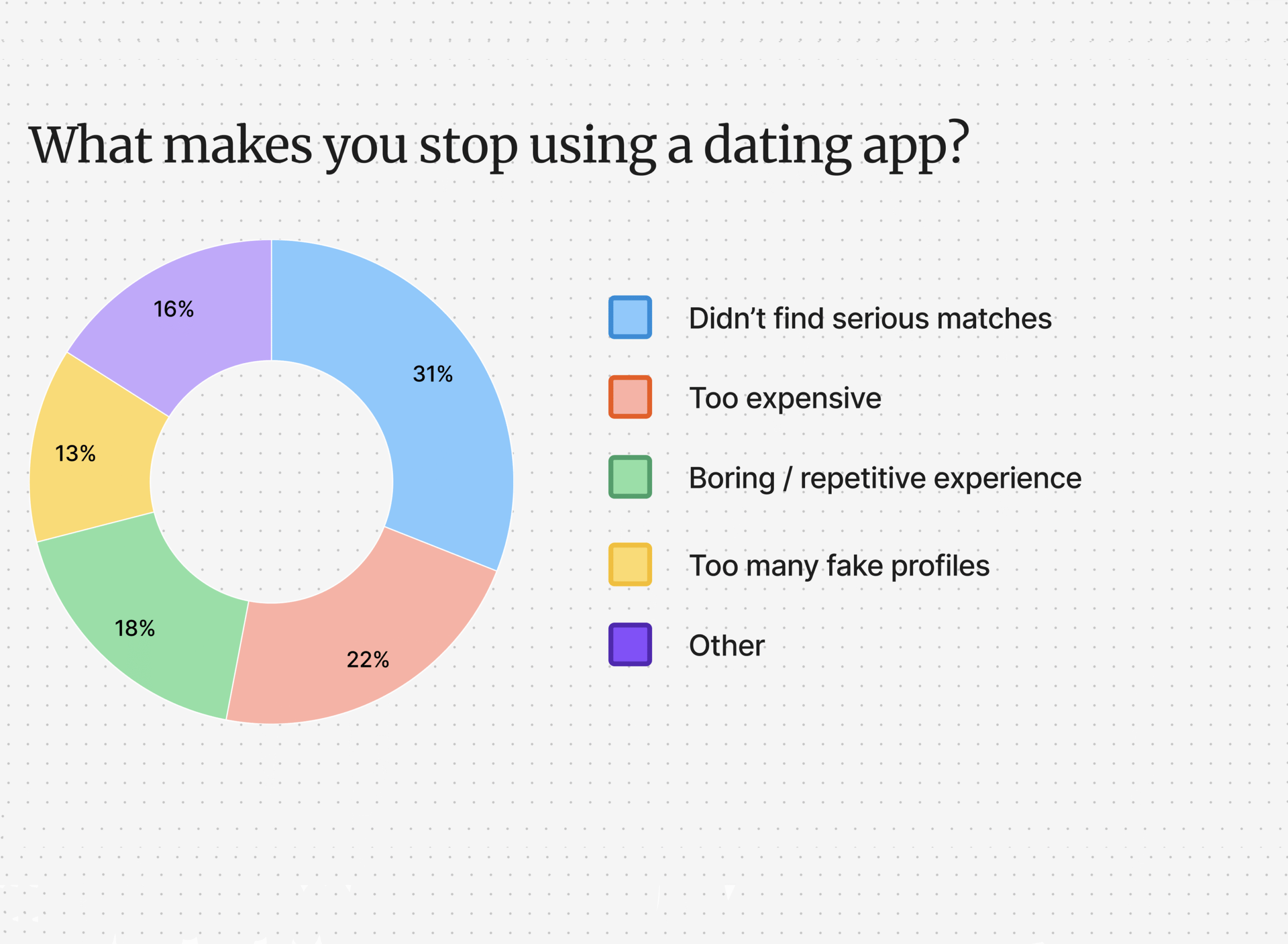
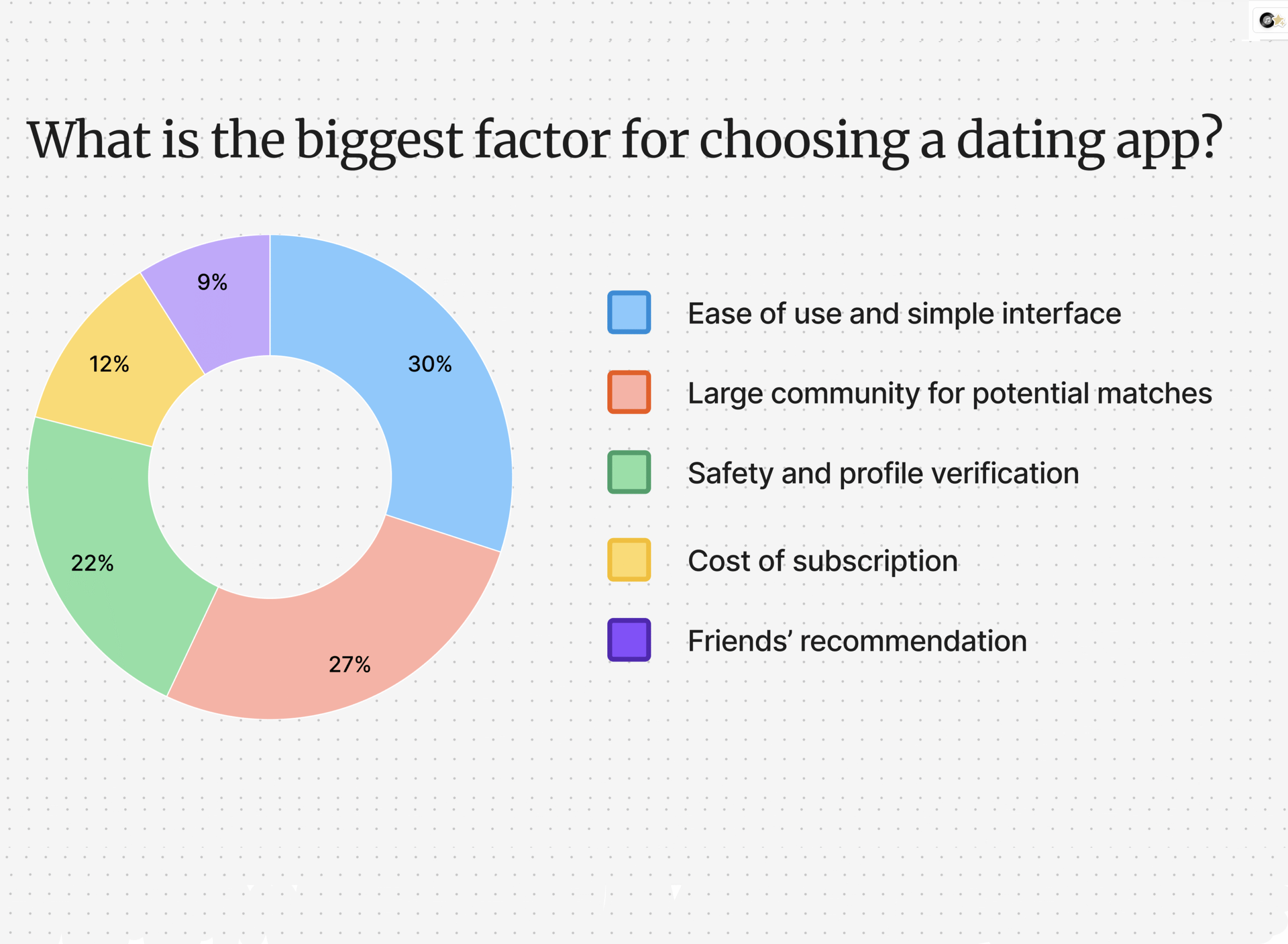
Ideation
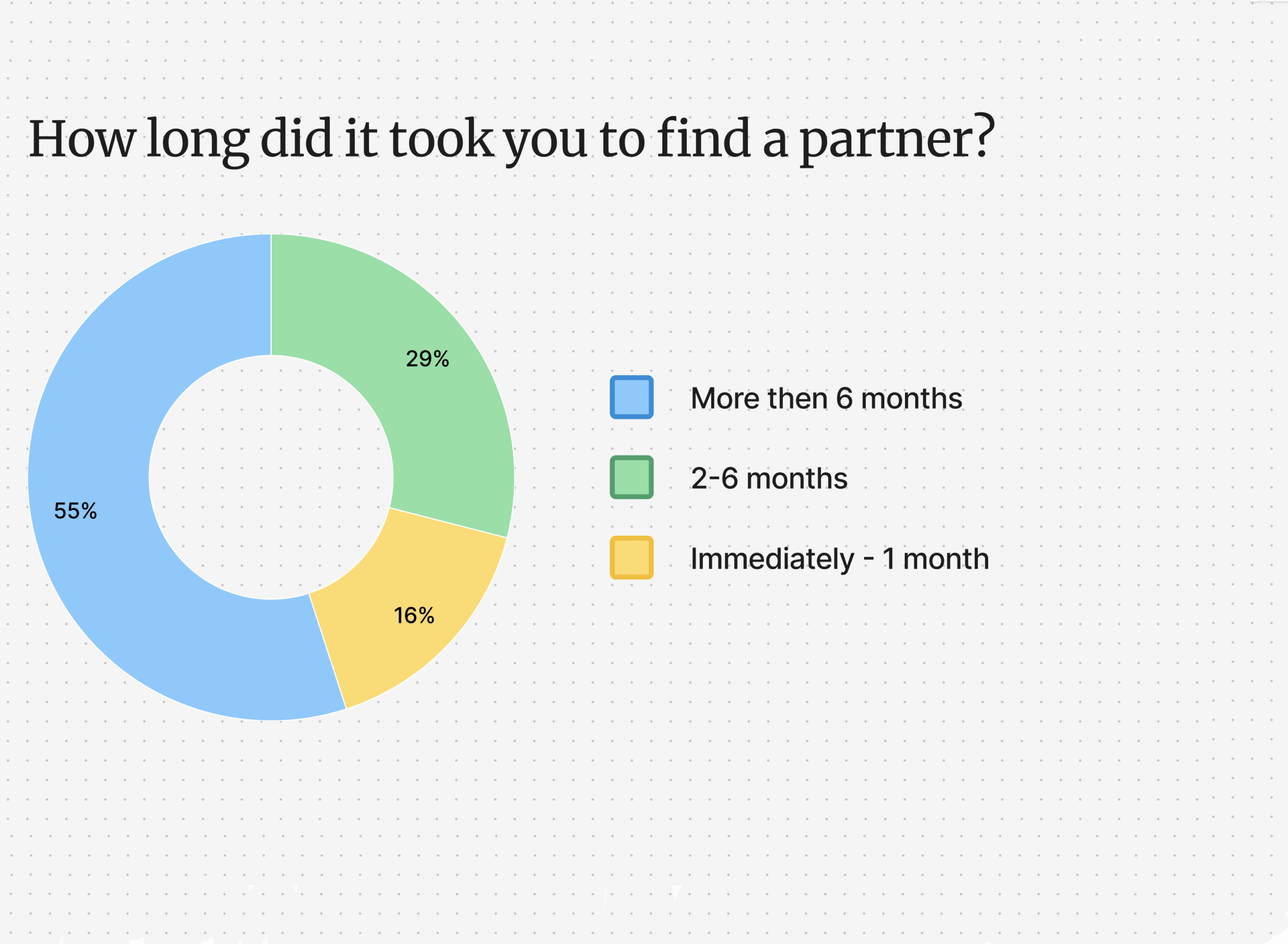
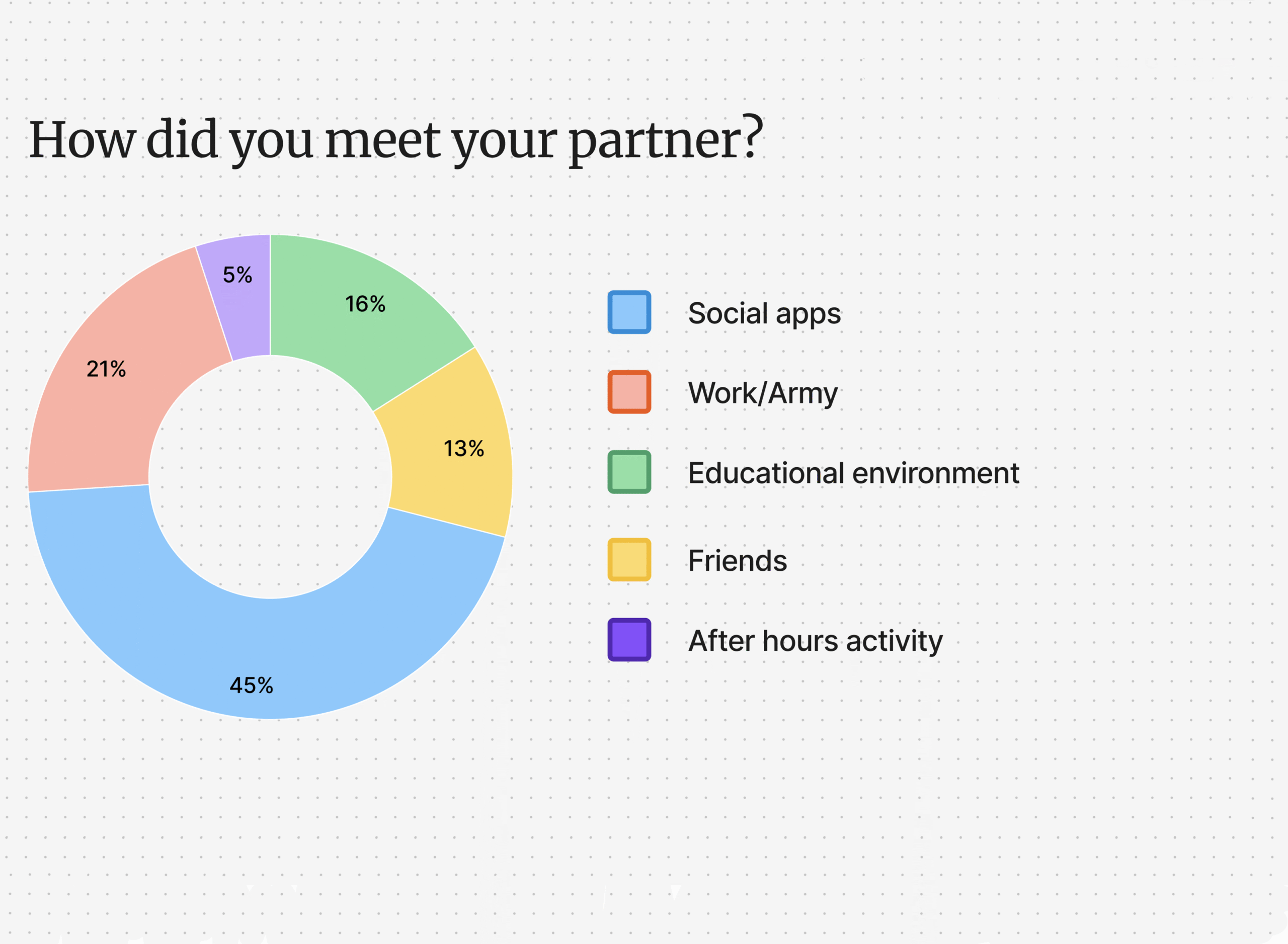
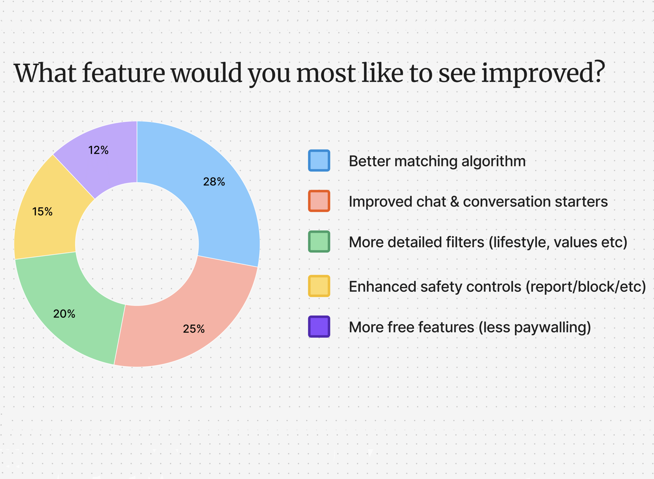
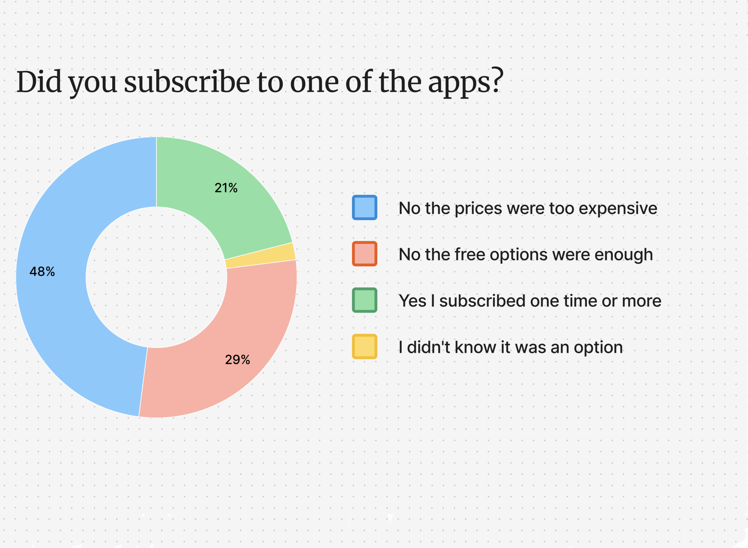
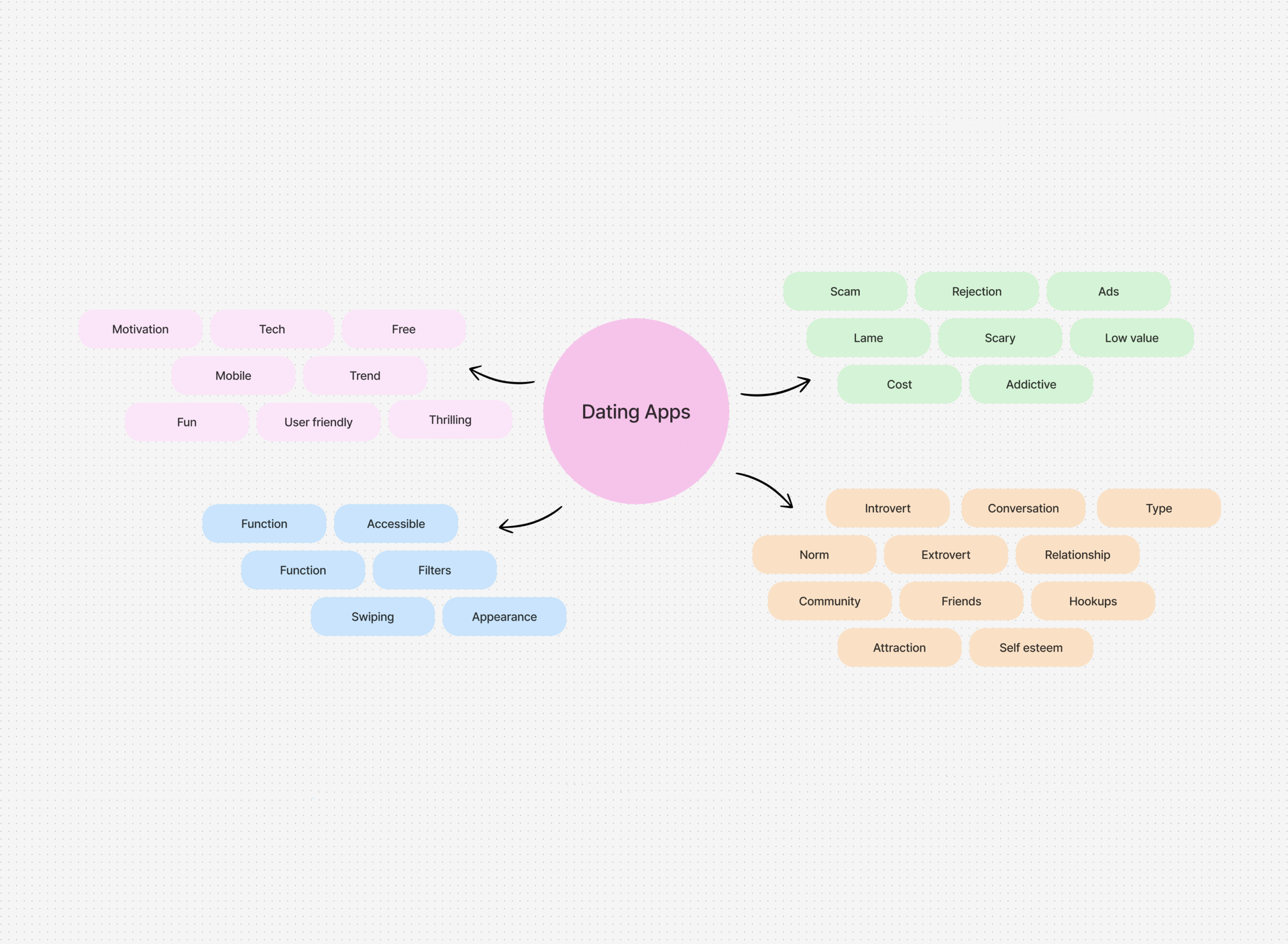
Surveys Form & Results
We created a close questions survey to get a better understanding of the user's thoughts and needs.
Research synthesis & mapping tools
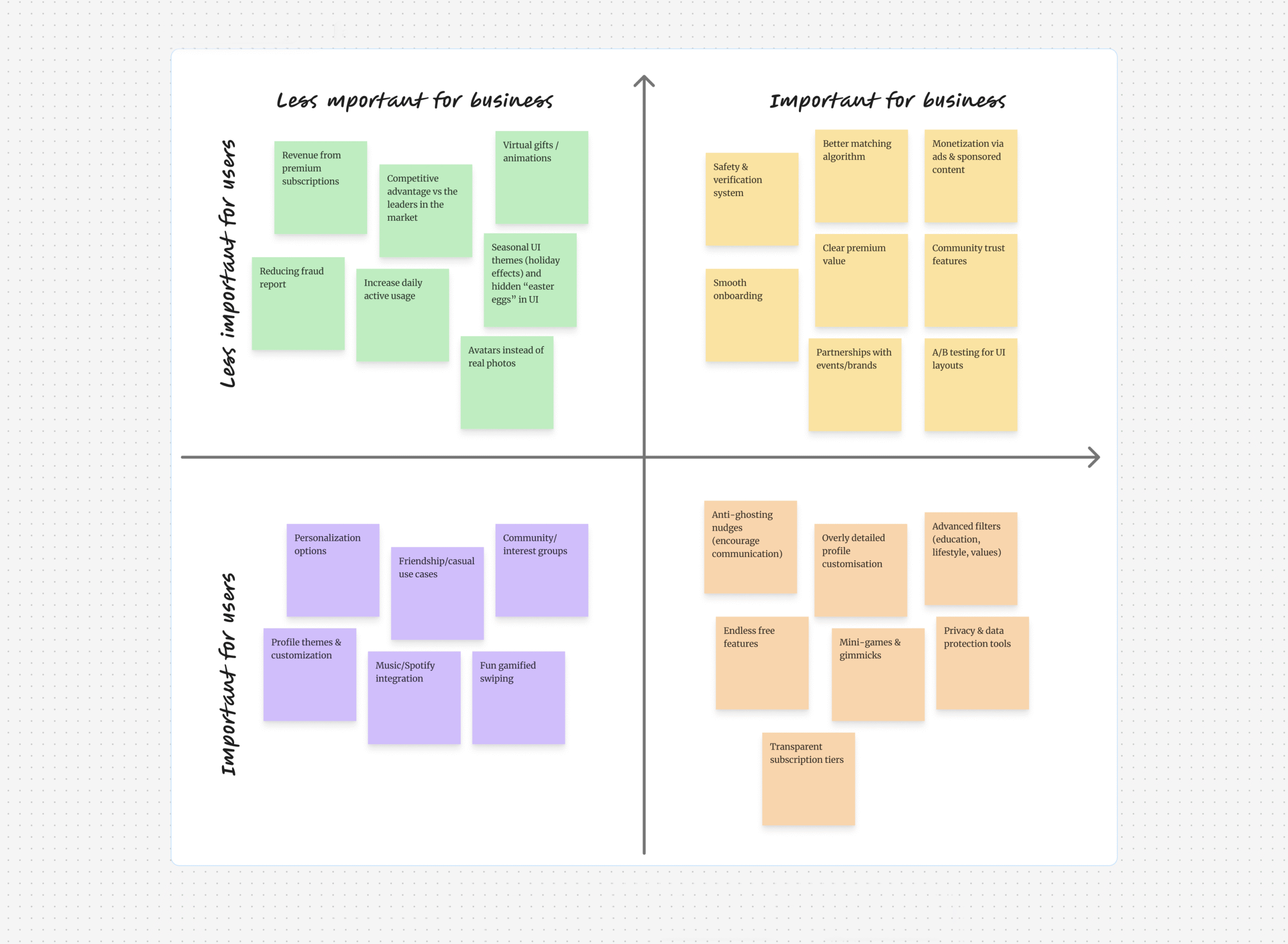
To gain a deeper understanding of the user's needs, we conducted brainstorming sessions and identified user story ideas that align with their requirements.
After careful evaluation, we selected a few user stories that best address the user's needs and provide optimal solutions.
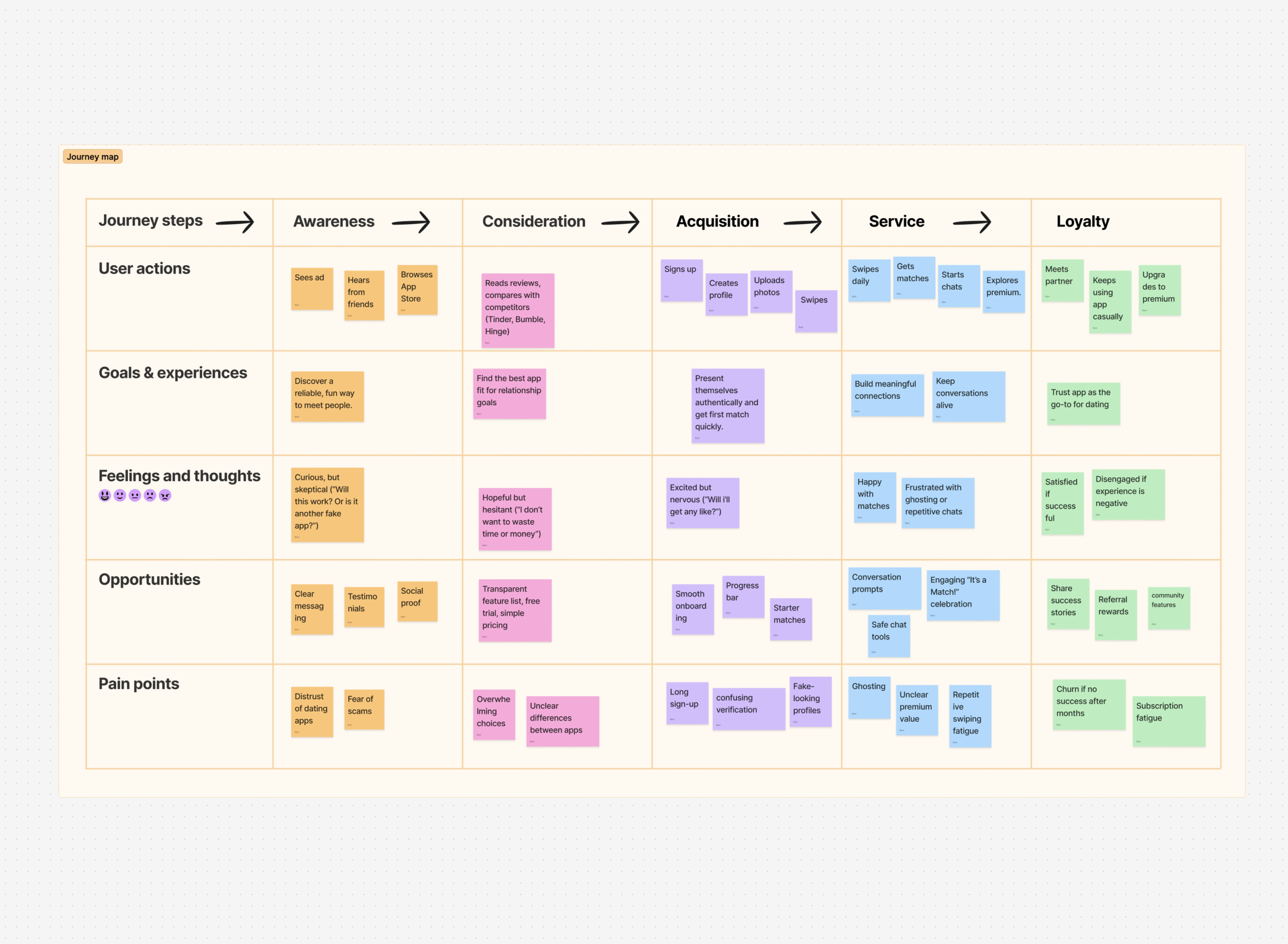
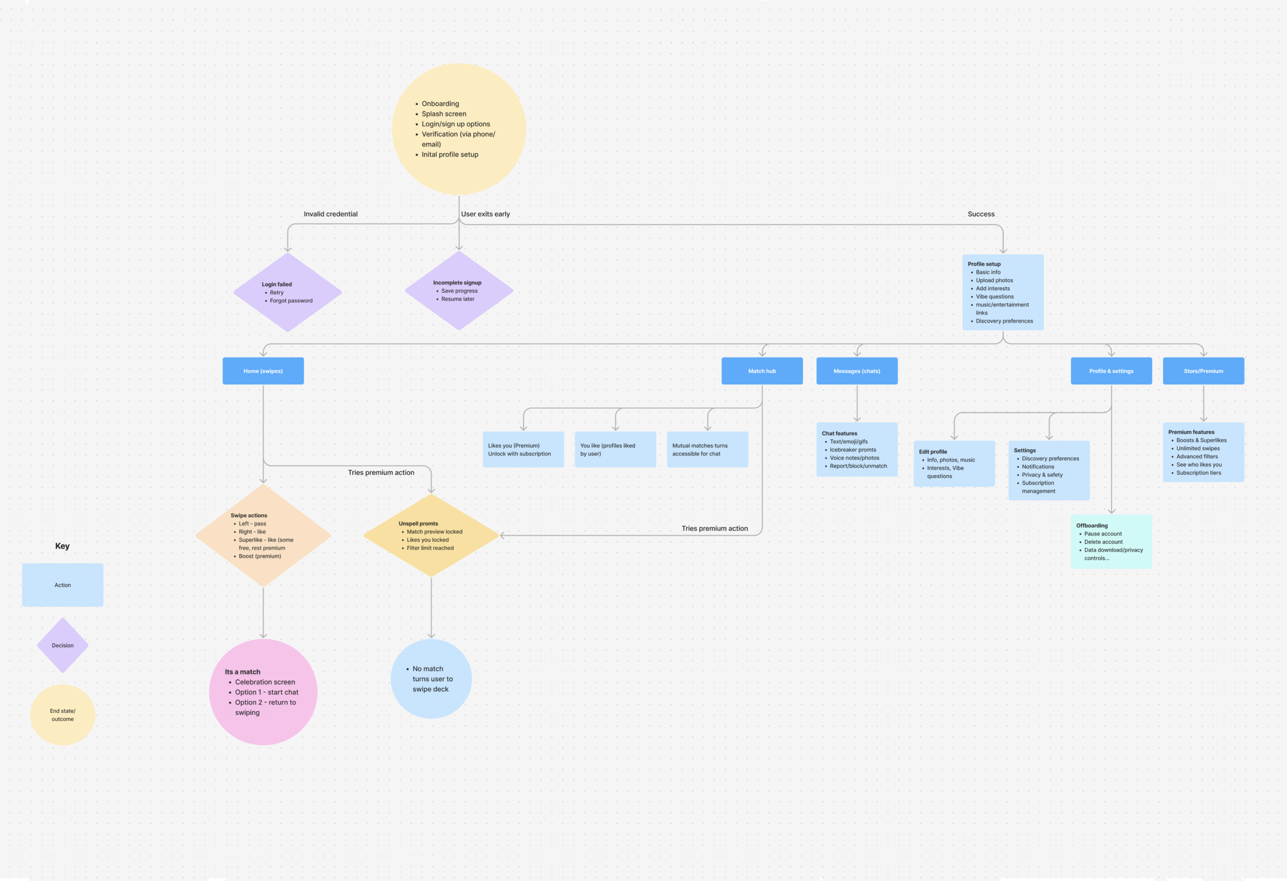
User Flows
As part of the design process, we carefully crafted user flows to map out the anticipated user journey and inform design decisions.
This exercise proved to be incredibly valuable as it allowed me to visualize how users would navigate and interact with the product.
By following the user flows, we were able to identify any gaps or areas for improvement, ensuring a more intuitive and user-centered design
Design
Logo Creation
App Structure
Wireframes
Design system
As the lead designer, I took on the responsibility of establishing a cohesive and visually appealing design system.
This involved creating a comprehensive style guide that outlined color palettes, typography, iconography, and other visual elements.
By defining consistent design patterns and guidelines, I ensured that every aspect of the platform maintained a unified and polished look.
This design system served as a valuable resource for the entire team, fostering collaboration and maintaining visual coherence throughout the development process.
Developer's Handoff
The developer handoff process was designed to facilitate a seamless transition from design to development, ensuring clarity, efficiency, and accuracy in bringing SentimentIQ to life. By providing detailed documentation, including design specifications, style guides, and interaction guidelines, developers had a comprehensive reference to accurately translate the high-fidelity design into functional code.
Take aways
This was my first large-scale UX project where I took ownership of the entire process — from initial research and competitive analysis to journey mapping, wireframing, and prototyping.
It gave me a holistic understanding of how all the pieces connect.
Starting from scratch meant I had to deeply investigate user pain points, motivations, and goals. I learned that investing time in affinity mapping, surveys, and user flows created a much stronger foundation for design decisions.
One of the biggest insights was seeing how often user priorities (trust, safety, fun use) can conflict with business priorities (subscription revenue, retention). Learning to visualize this tension with prioritization maps was a key skill I developed.
Complex Problems Require Iteration
Dating apps touch on sensitive, emotional, and behavioral issues. There’s no one-size-fits-all solution. Through journey maps and testing, I understood the importance of iterating continuously to balance simplicity with meaningful connection.
It set the standard for how I approach all future projects.
Additional Design Interface
The Dark Side
The idea behind dark mode is to reduce the light emitted by device screens while maintaining the minimum color contrast ratios required for readability.
We offer the user the choice of system-wide dark modes and the custom dark mode we created.