Making the transition

Introducing: Mishkan

Mishkan is a system for managing and allocating rooms for servicemen, as part of the IDF's future transition plan to relocate all intelligence units to the Kiryat Hamodiin base in the Negev in 2028.

Role

Lead UX/UI designer
• 7 Developers
• 1 Project manager
• 2 Designers
• 1 Analyst
• 3 QA

Process

• Project kick-off
• Discovery & research
• Ideation
• Testing
• Design
• Final Takeaway

Tools

• Figma/Figjam
• Adobe creative suite
• Jira
• Trello
• Google meet
• Google workspace
• Matomo

Duration

8 months +

Understanding the Challenge

Managing the transition, step by step

As part of the Intelligence Division’s transition to the new Kiryat HaModi’in base in Beer Sheva,
thousands of servicemen and servicewomen will be relocated across multiple sites.
This large-scale move involves complex logistics — from assigning rooms according to gender, rank, and unit,
to accommodating medical needs and operational constraints.

Project kick-off

I used the project kick-off as an opportunity to bring together key stakeholders — including representatives from logistics, HR, and operations — to align expectations, clarify requirements, and define shared goals before moving into the design phase.
The session encouraged open discussions, helping the team identify early challenges, share insights, and establish a unified understanding of the project vision.

Current situation

The existing room-assignment process relies heavily on Excel sheets, email threads, and phone coordination — which leads to:
• Lack of synchronization between departments
• Frequent human errors in assignments
• Overload on logistics and HR officers
• Unclear status tracking for servicemen
• Overall uncertainty and inefficiency in decision-making

System goals

• Create a smart, transparent, and controlled digital system that:
• Reduces assignment errors and logistical irregularities
• Reflects real-time, accurate data for all stakeholders
• Provides a unified experience tailored to different user roles

  • The challange

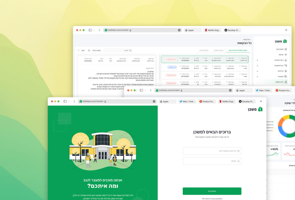
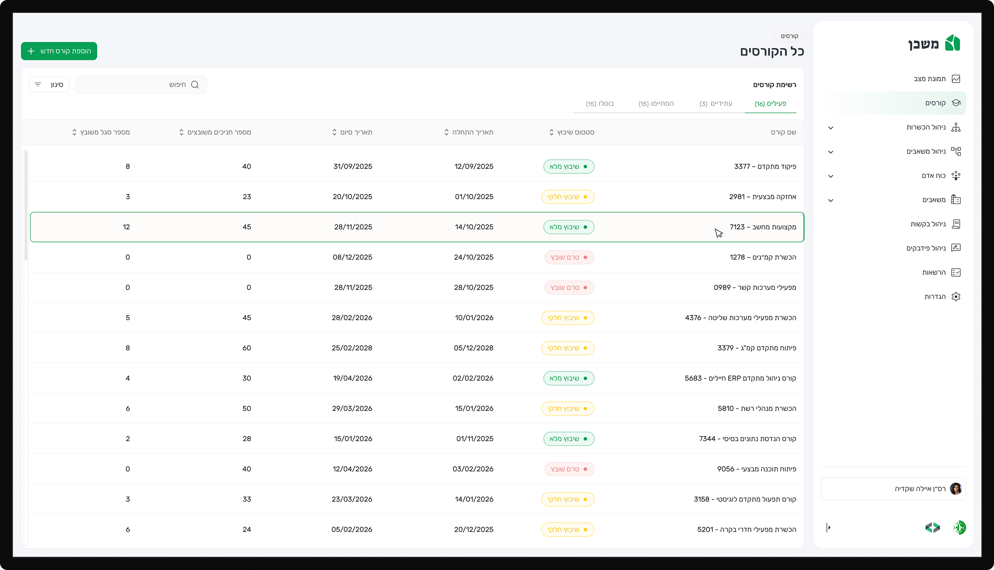
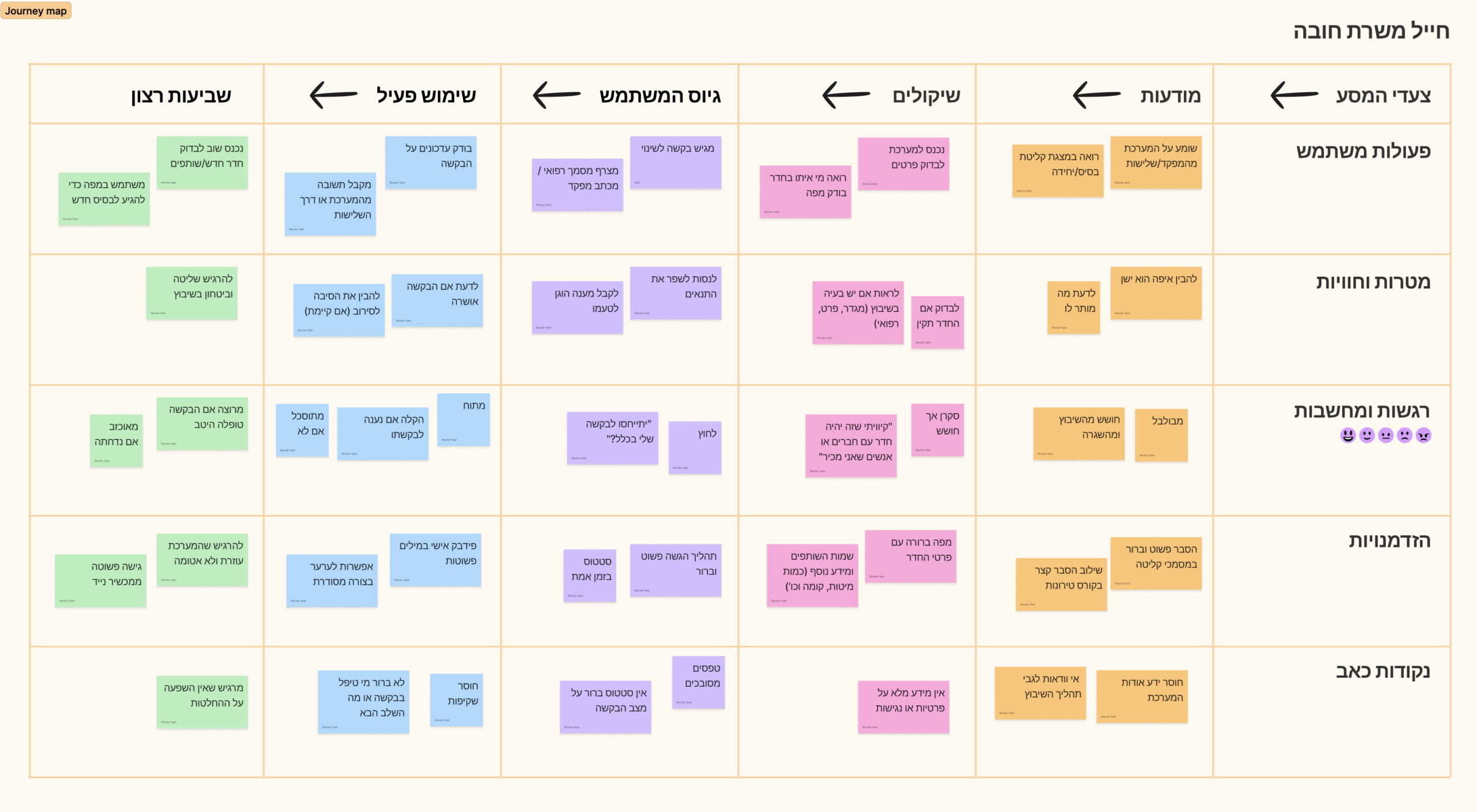
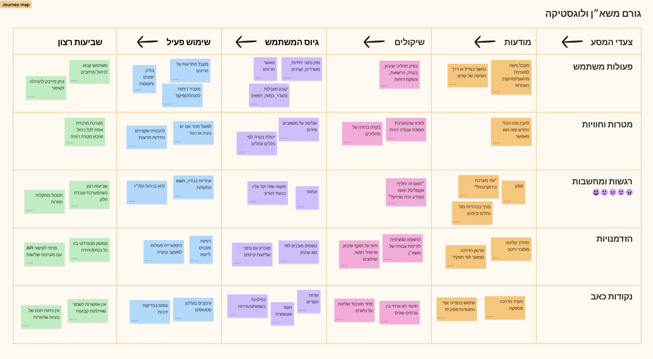
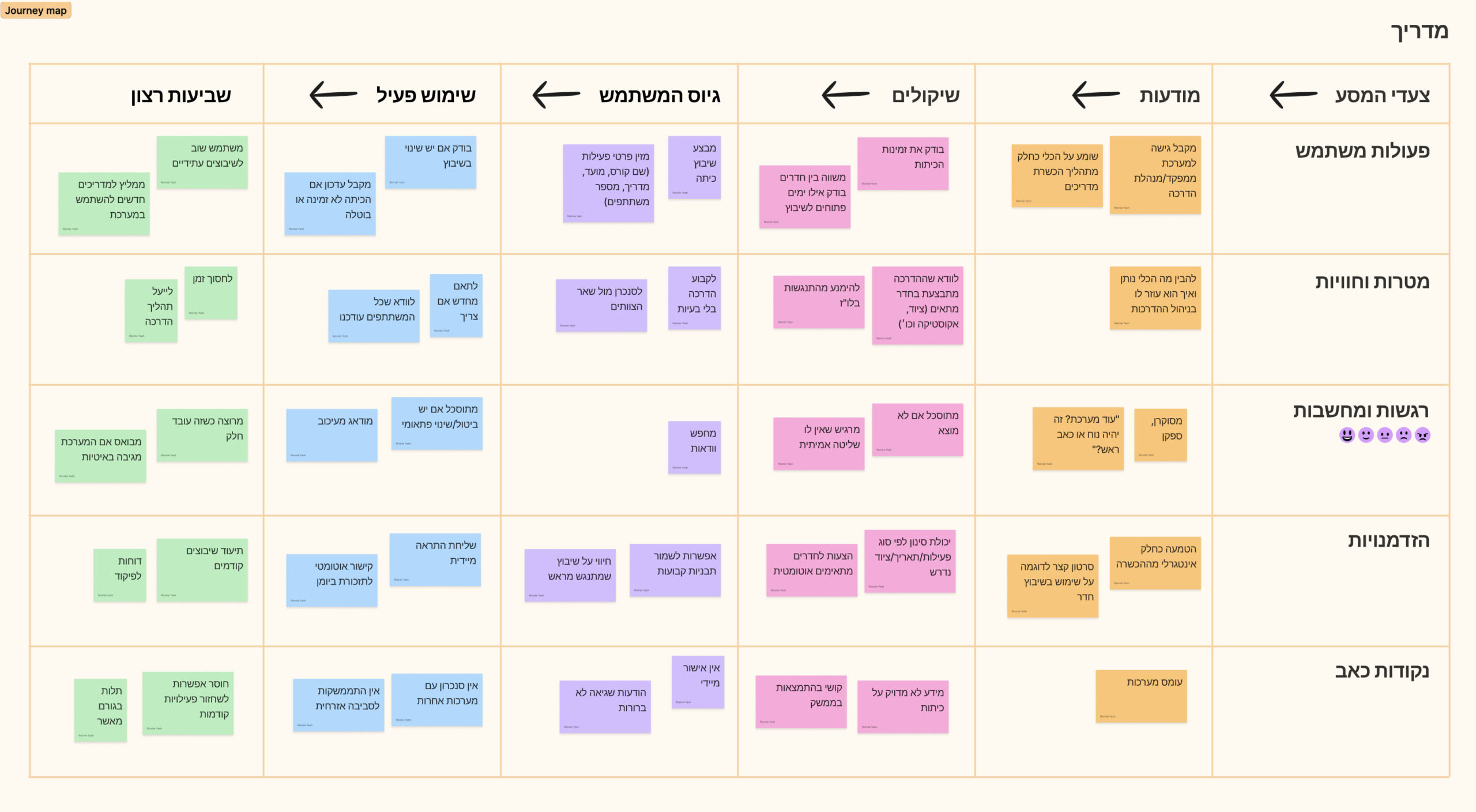
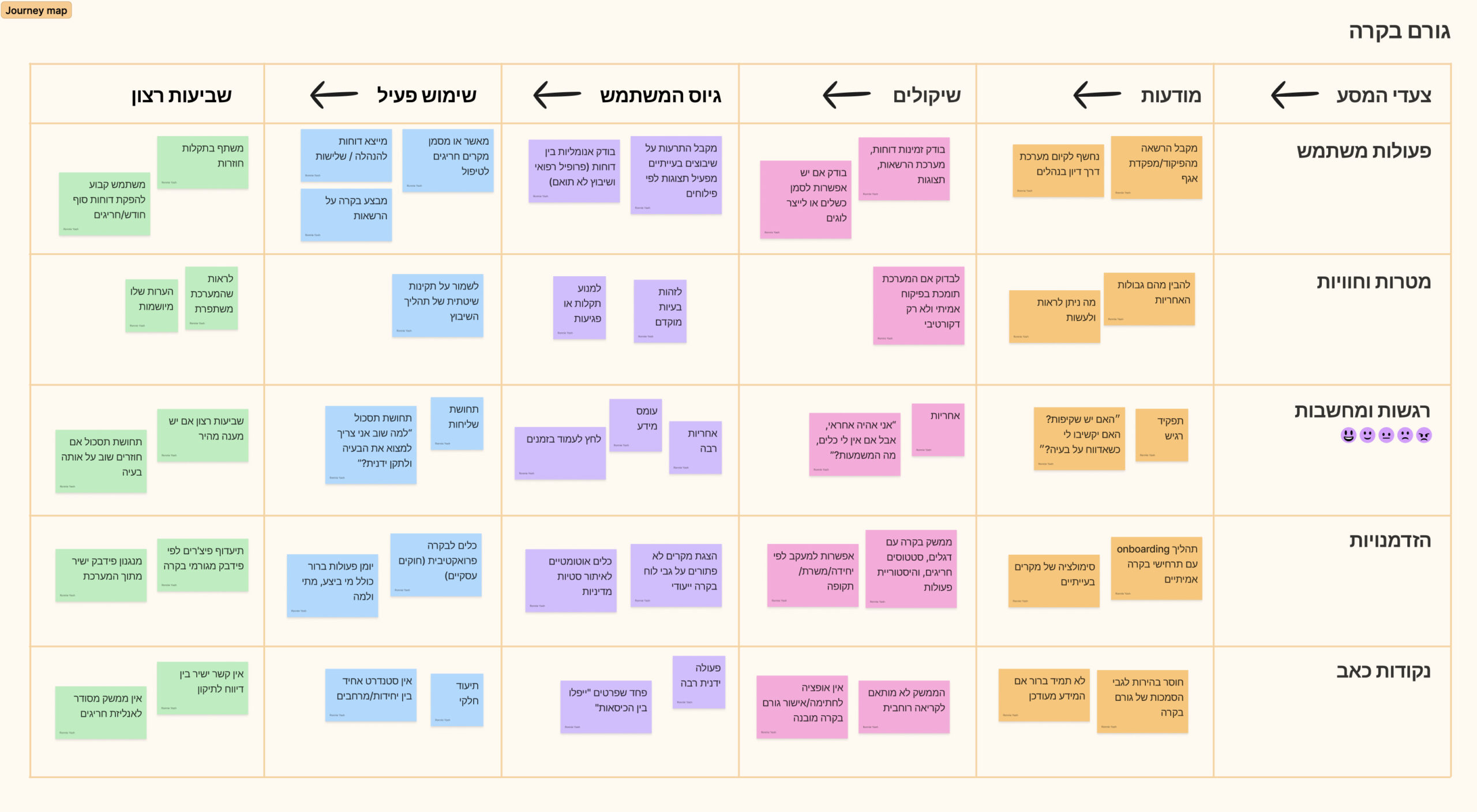
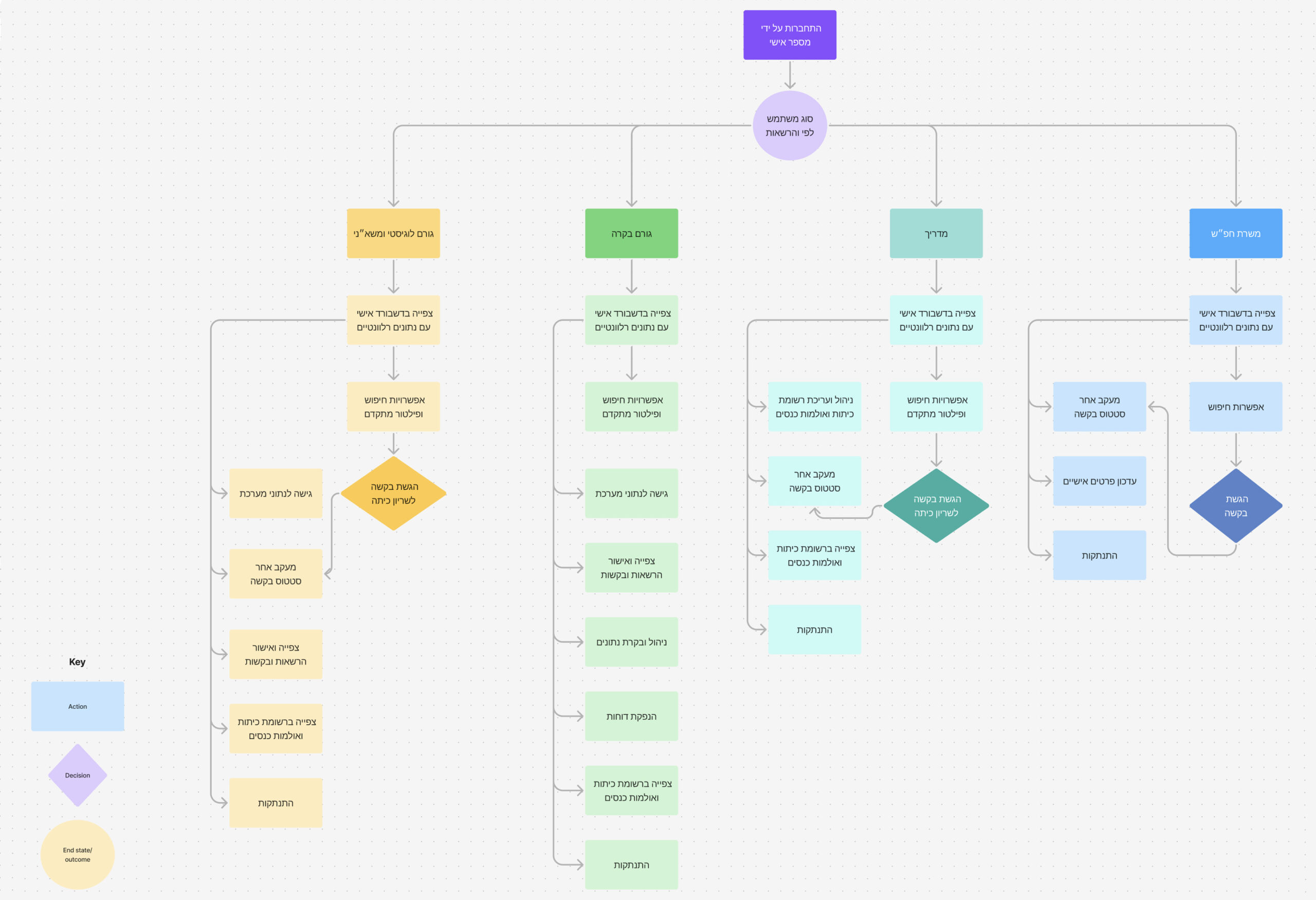
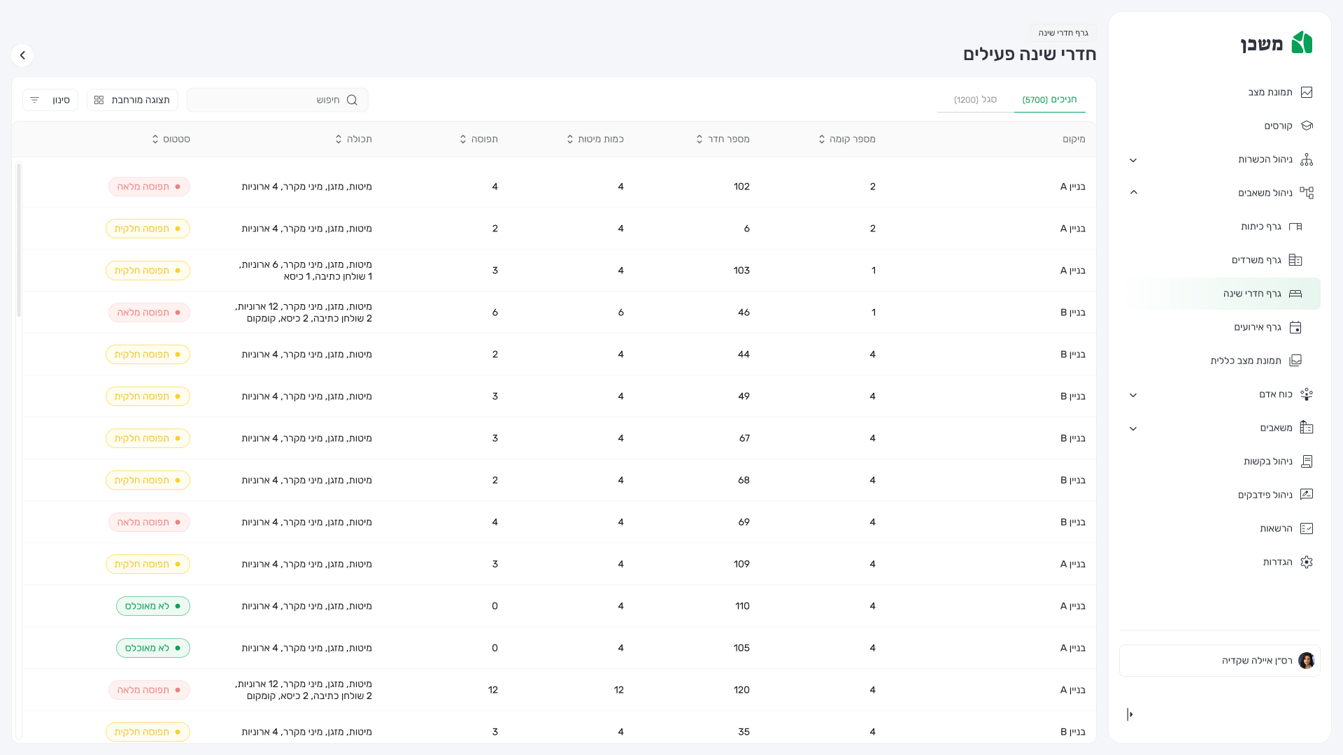
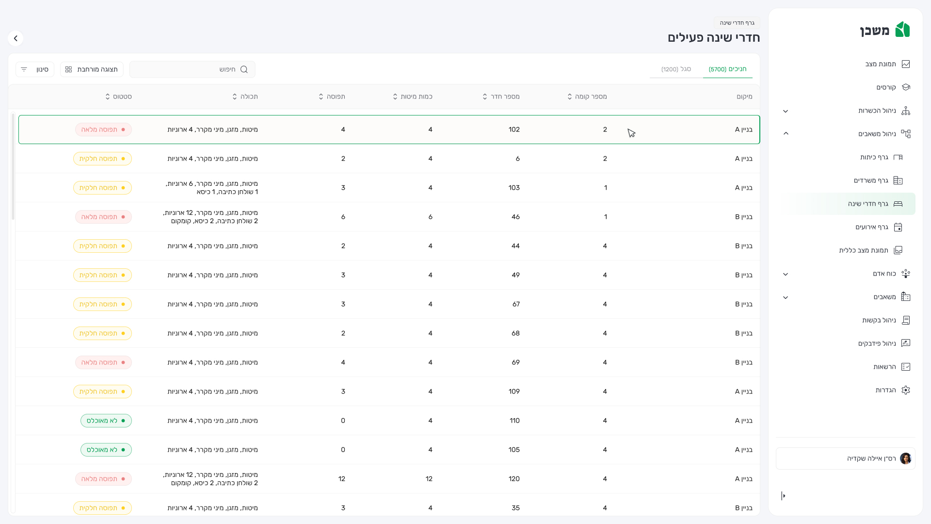
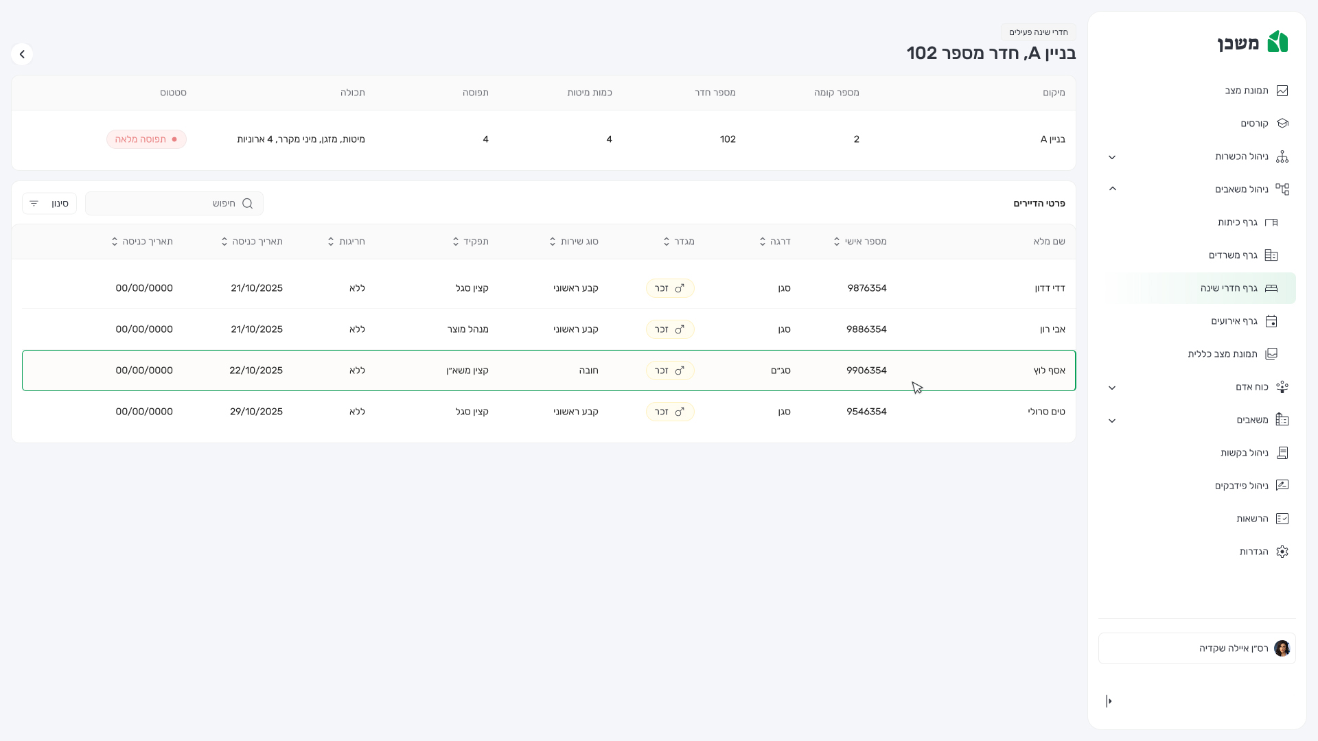
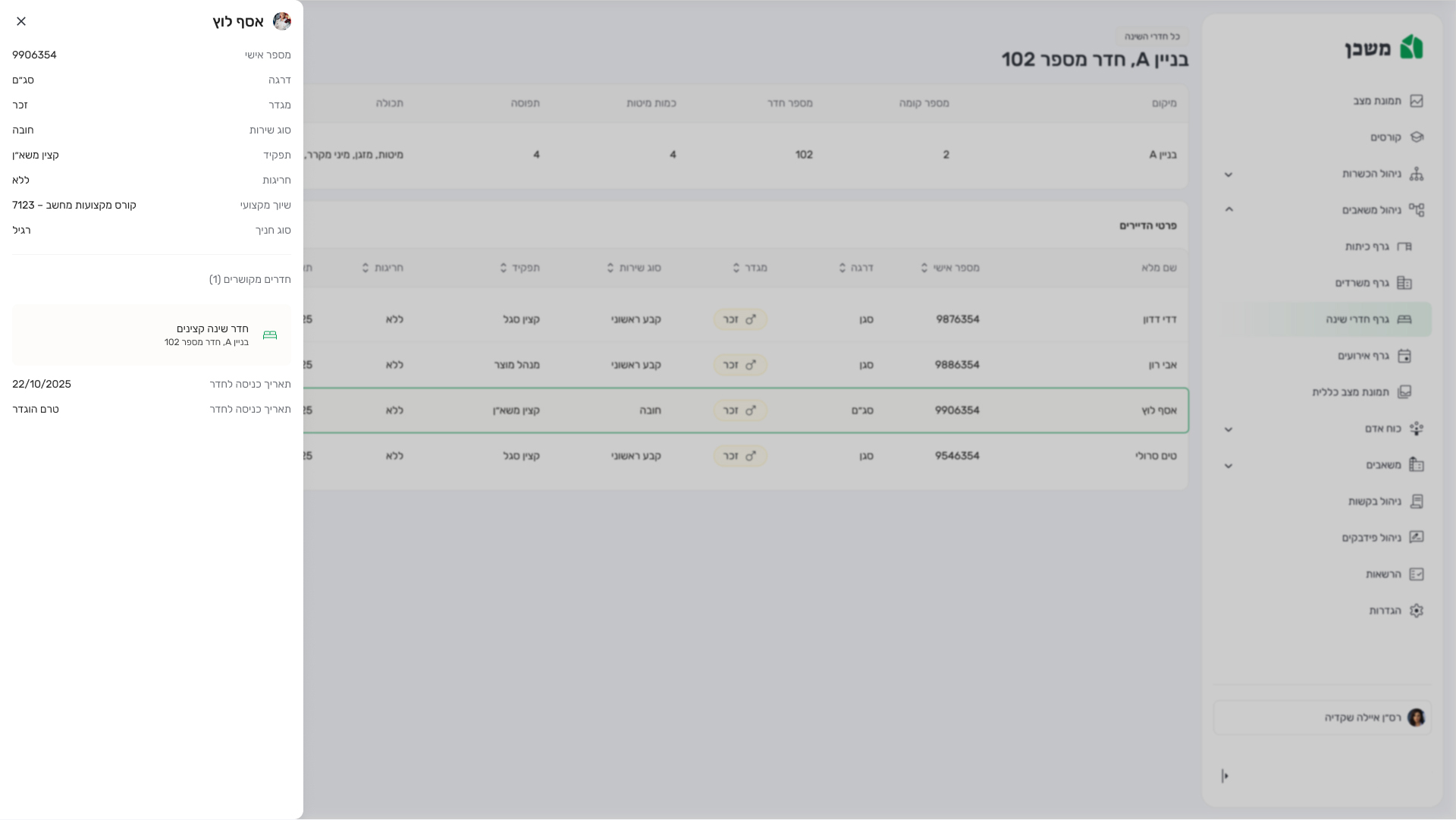
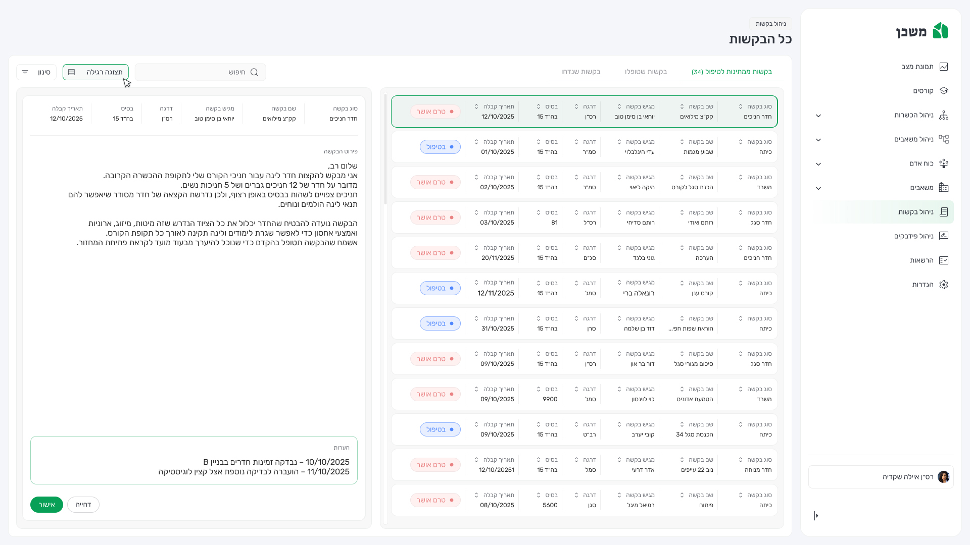
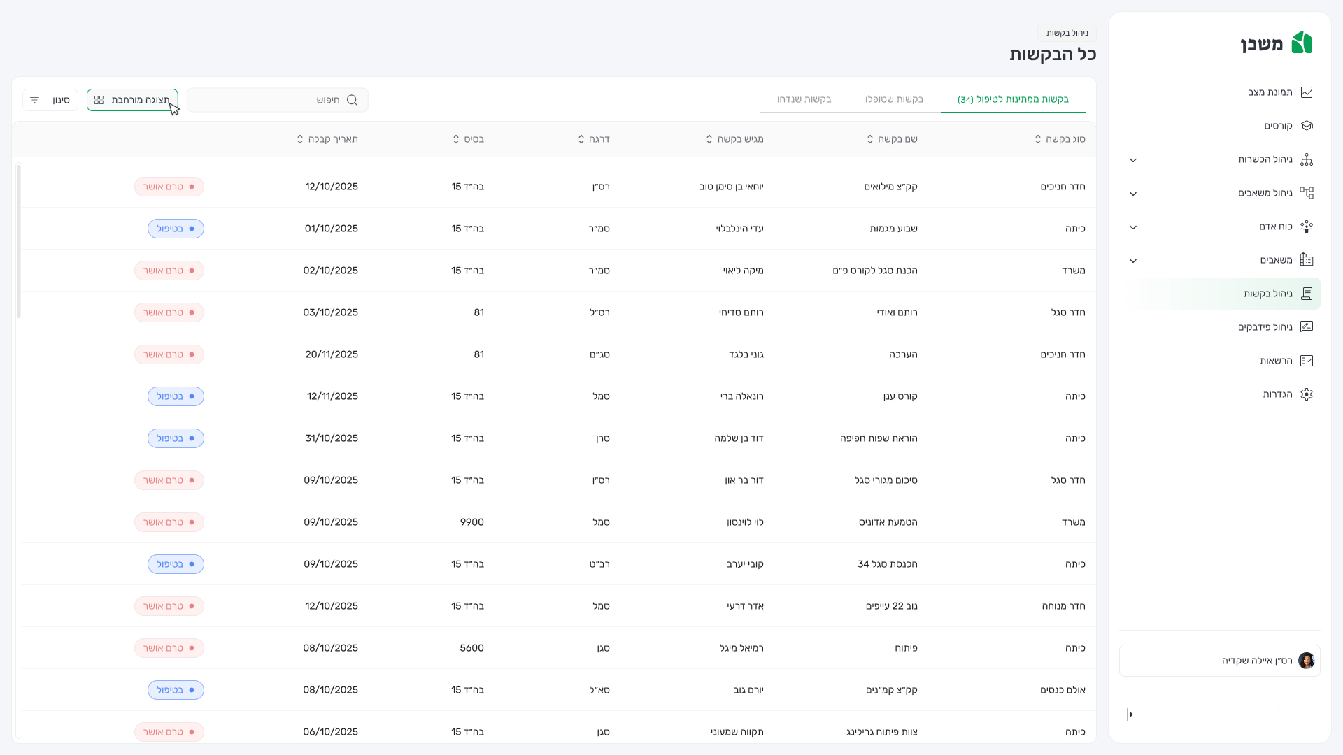
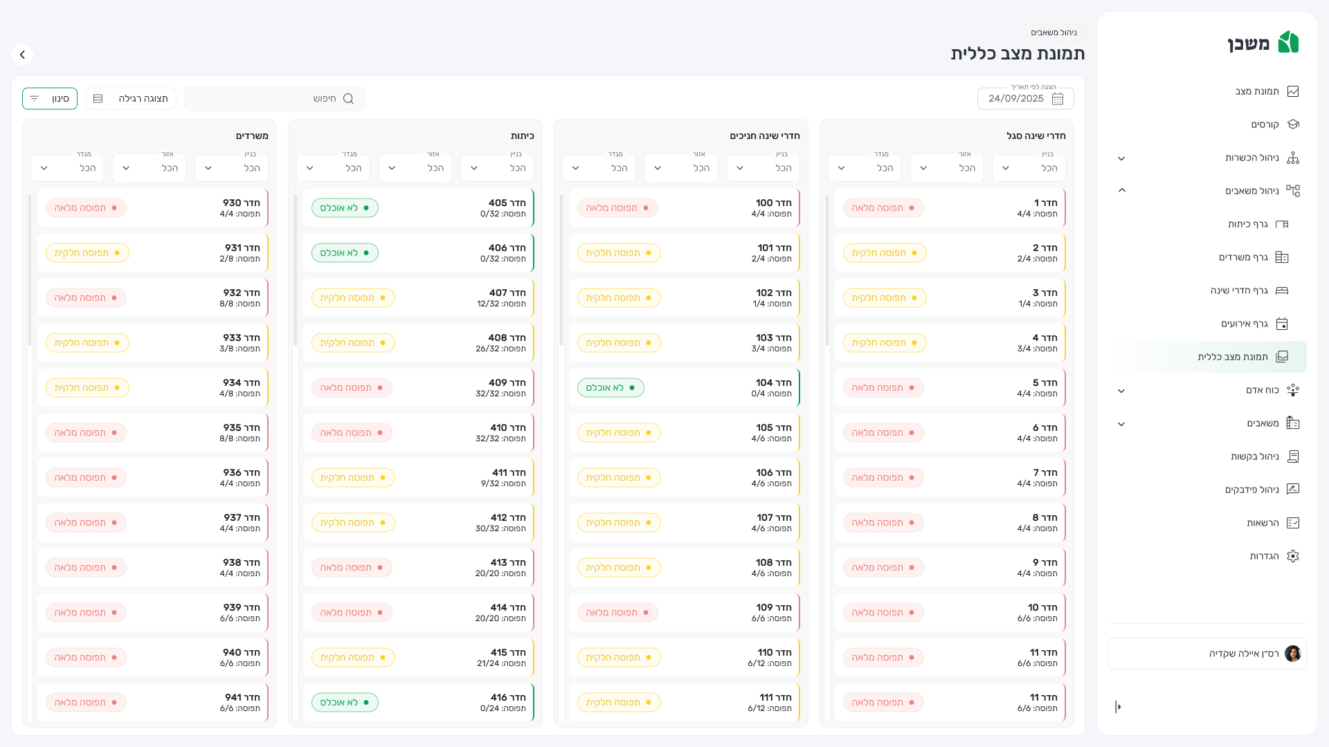
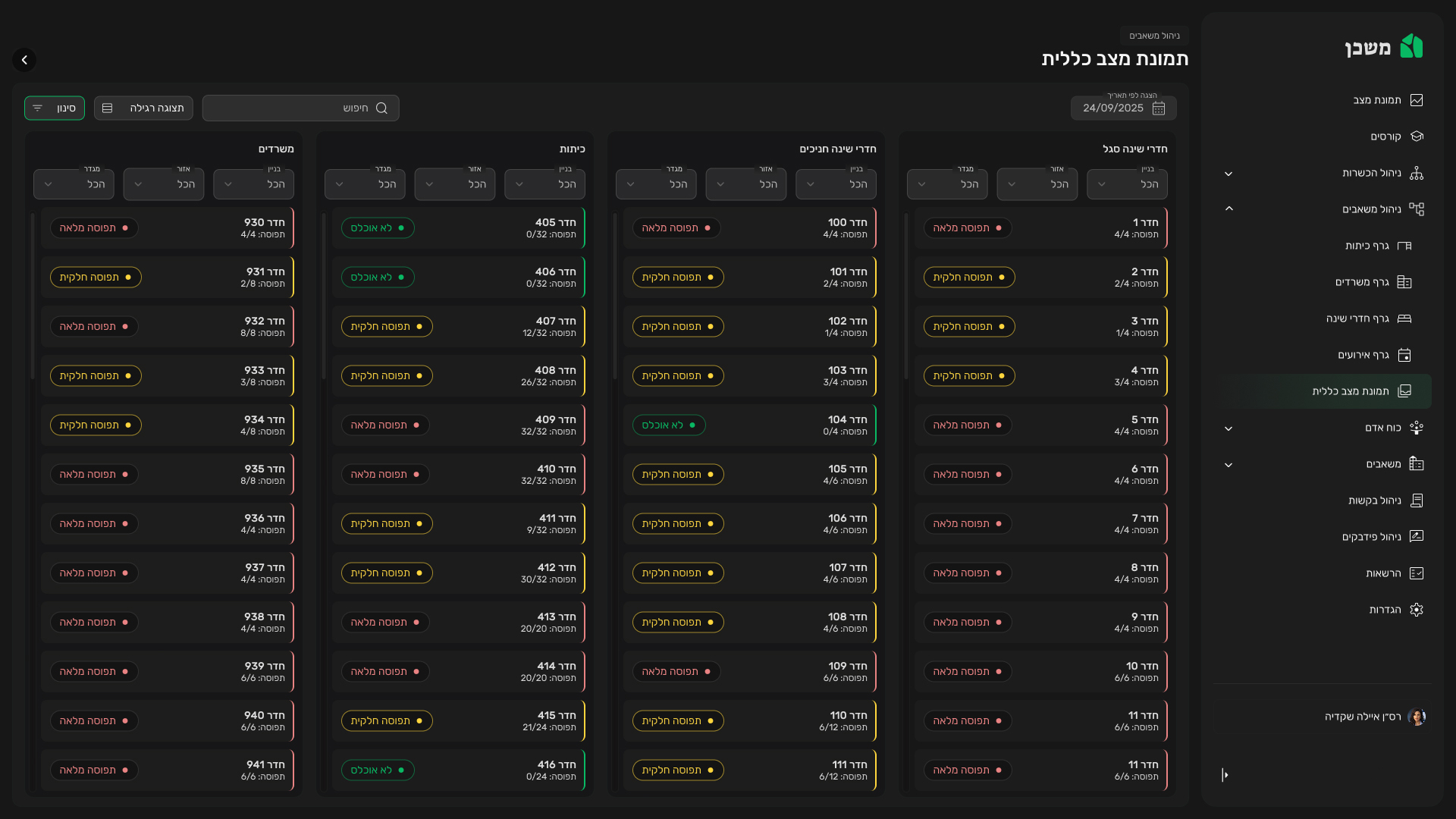
    Understanding how to replace a fragmented, manual process with a unified digital platform that ensures fairness, efficiency, and real-time coordination between multiple units.

  • The objective​

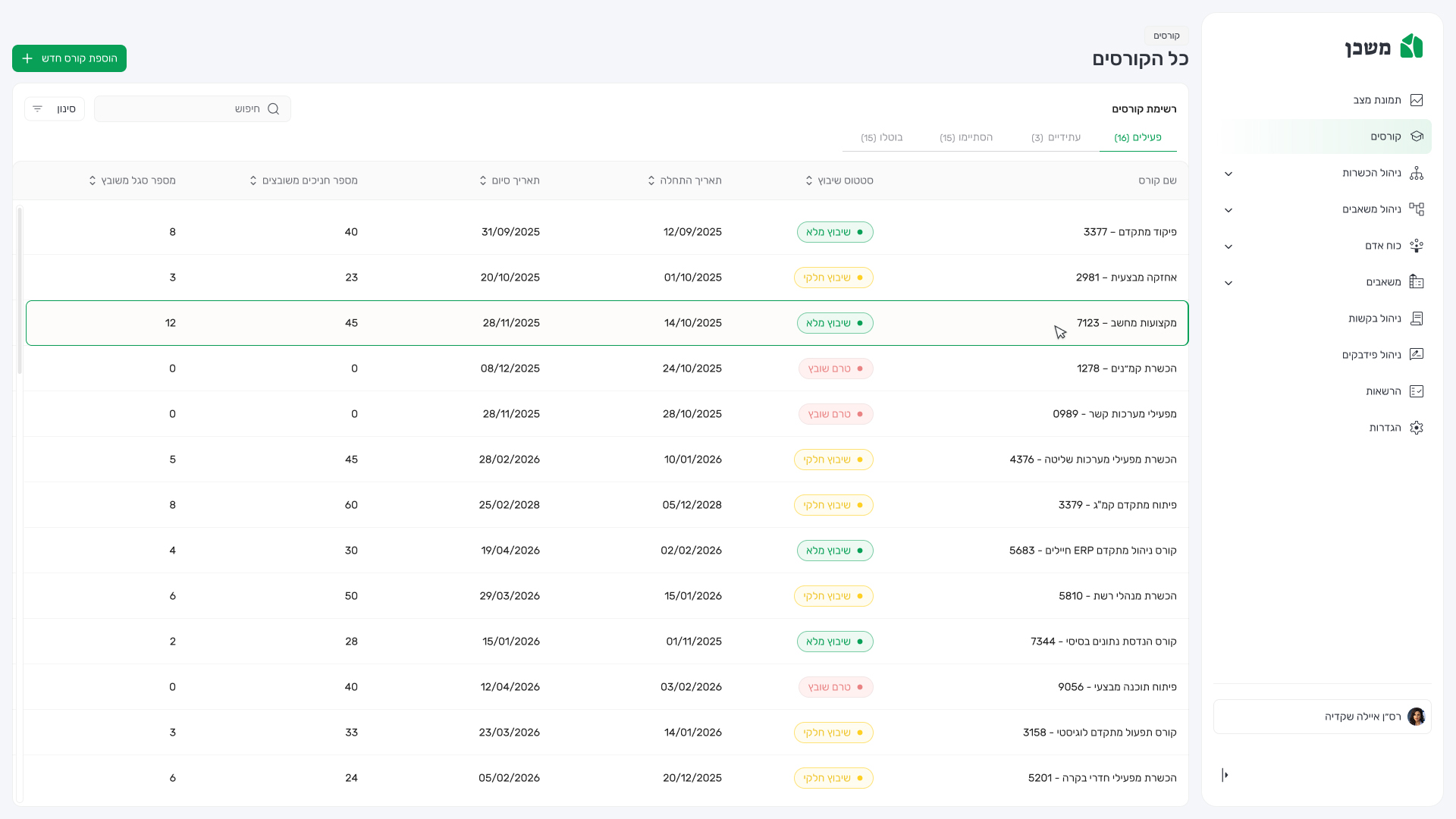
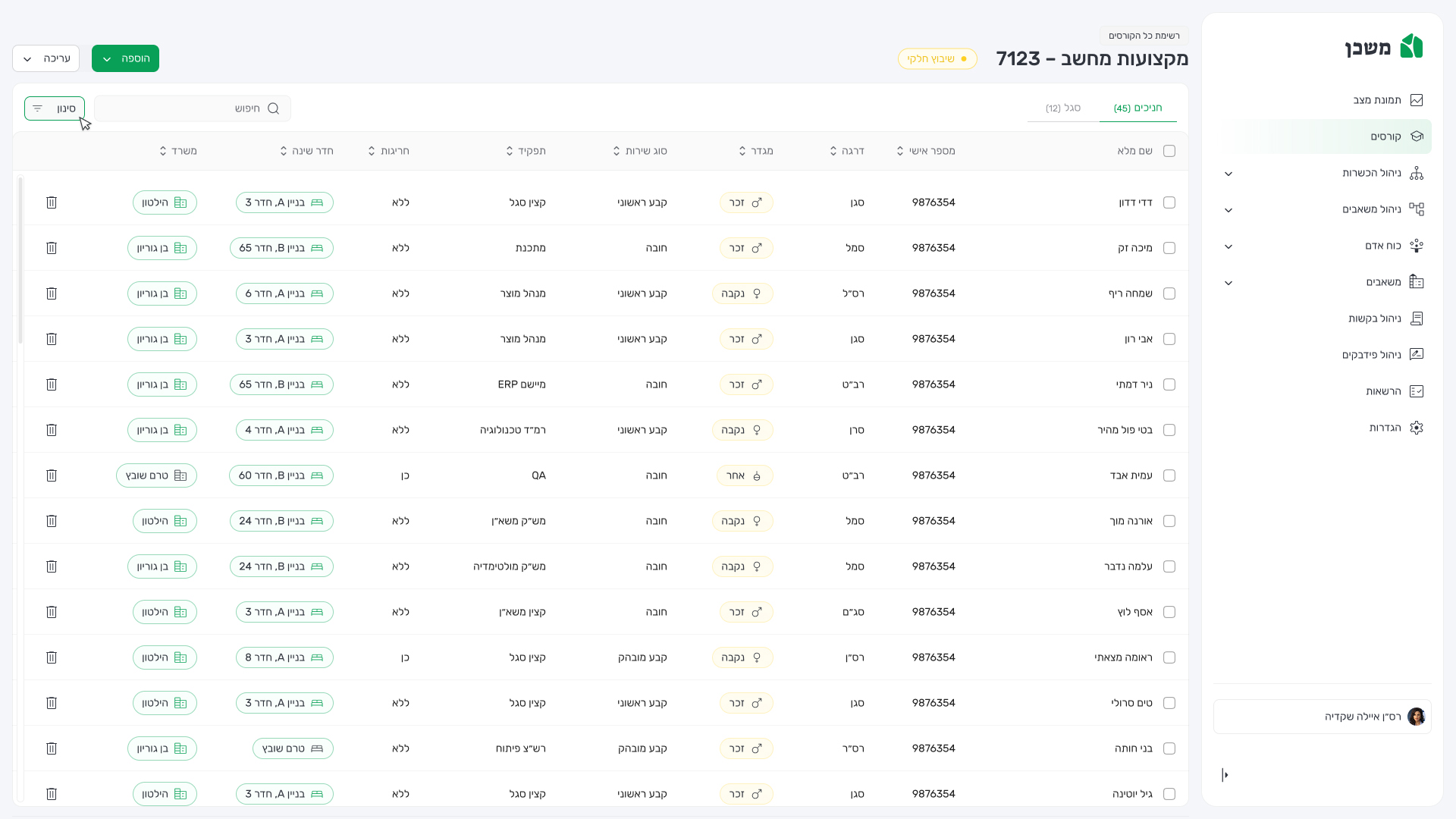
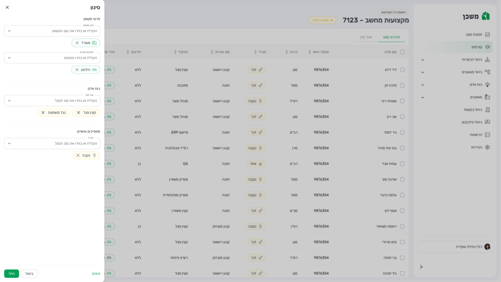
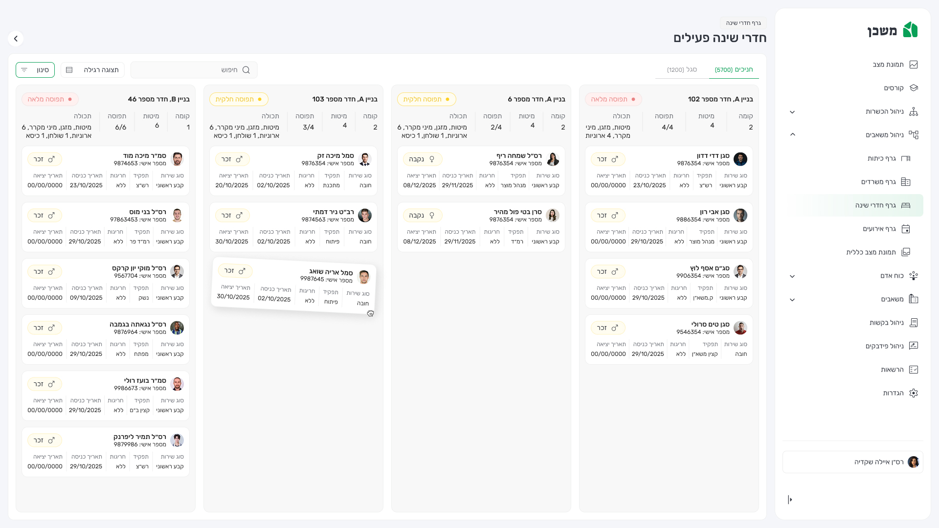
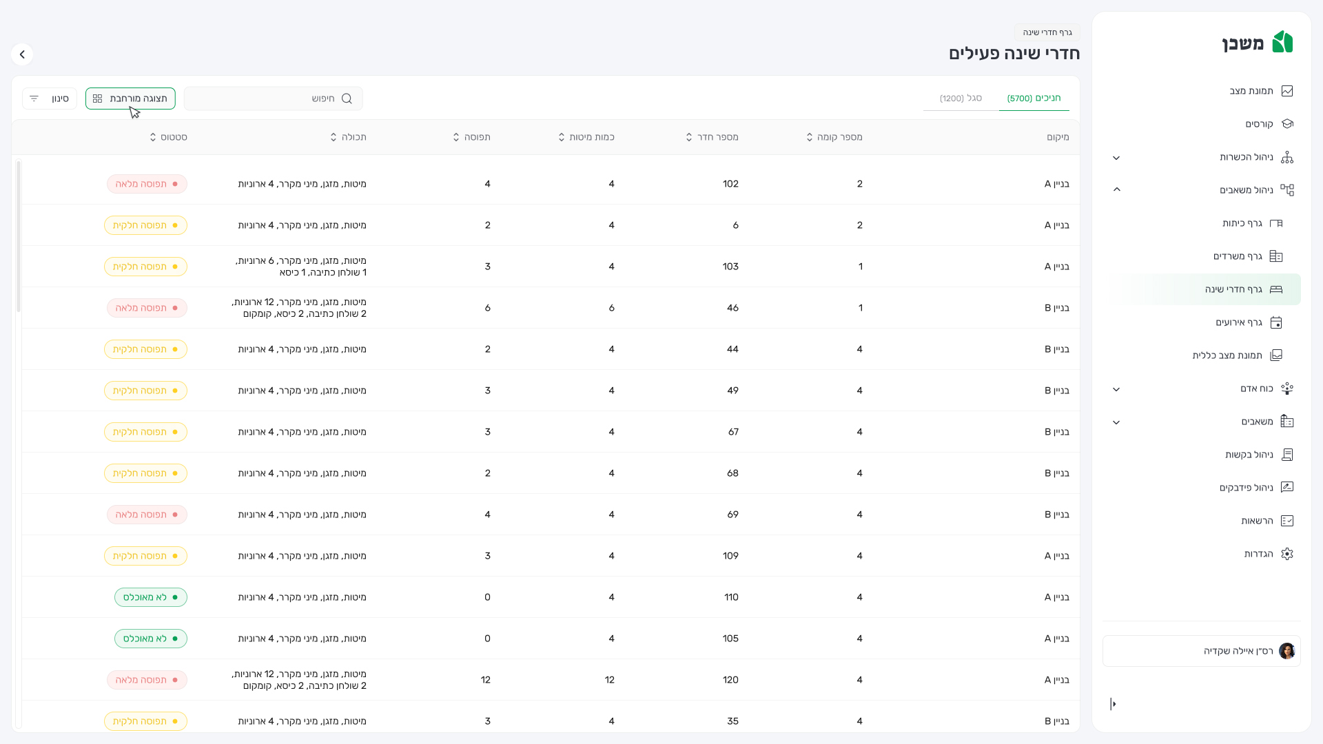
    Designing an intuitive system that simplifies room allocation, minimizes human error, and increases transparency and confidence for both officers and servicemen.

  • The scope

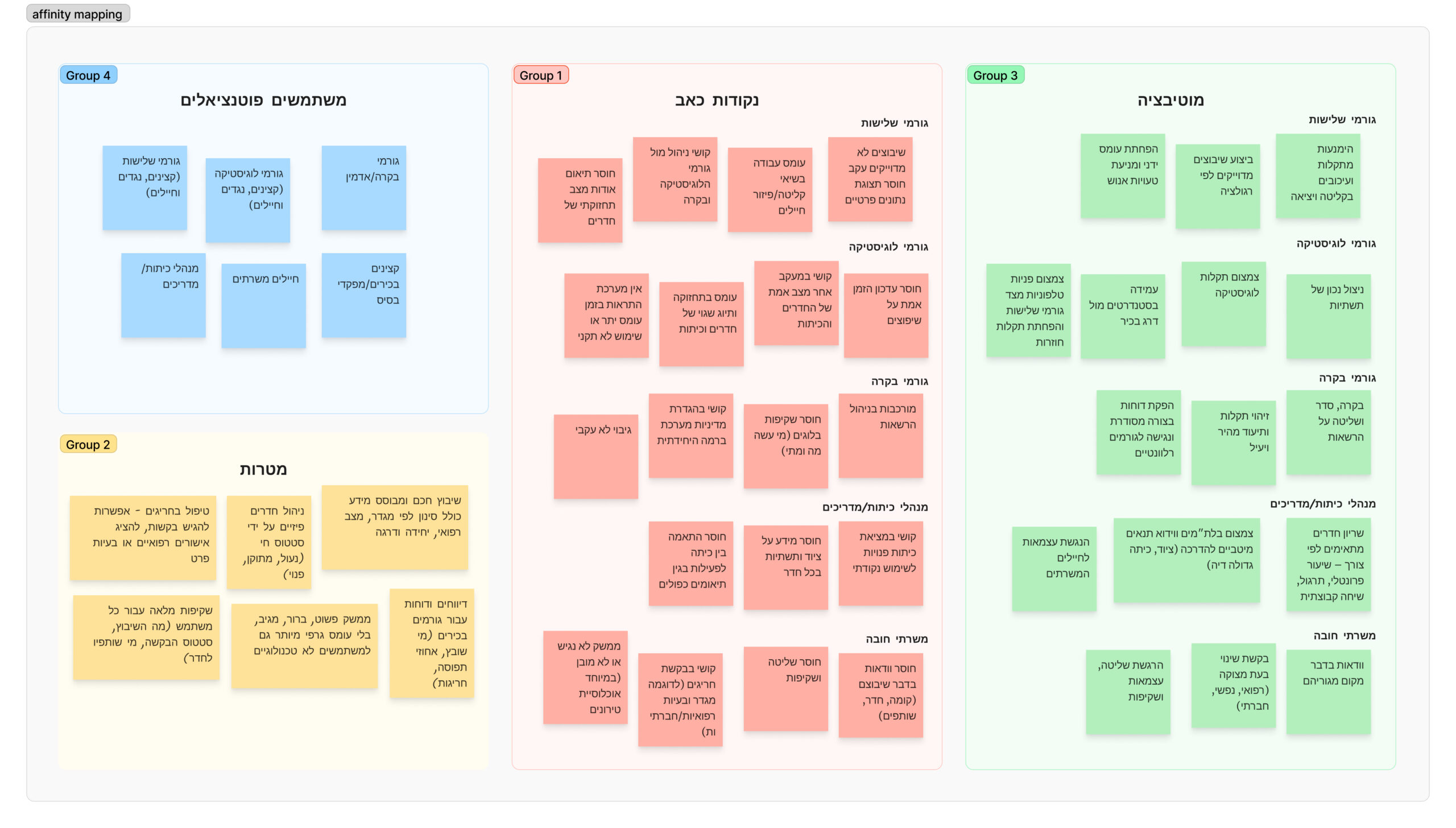
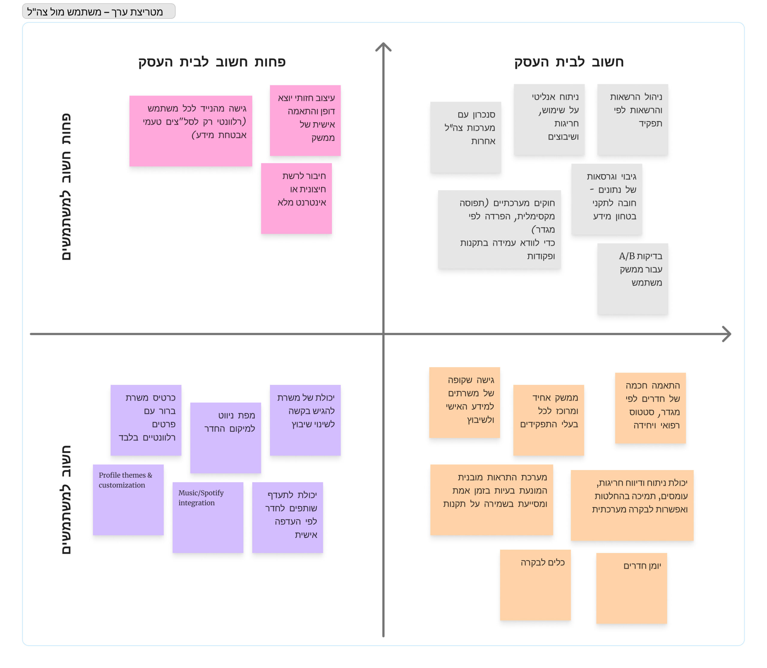
    Researching current workflows, identifying user pain points, and mapping communication gaps to define a product direction that supports the IDF’s large-scale transition to the Negev.

Discovery and research

Understanding the users

We created different personas whose demographics, motivations, goals, and frustrations represent the diverse needs of our users. These personas, each of which embodied typical user goals and needs, highlighted potential problem areas that allow for improvement in user experience.

Simple soldier

Represents the majority of system users who are affected by the relocation.
Needs:
• Quick access to room information
• Clear communication about assignments,
• Transparency regarding approval status
Pain points:
• Lack of visibility into where and with whom they’ll be placed
• Frequent changes
• Dependence on third parties for updates

Instructor

Conducts classes, supervises groups of soldiers during transit, and ensures that living arrangements meet training or operational needs.
Needs:
•Ability to view room allocations for trainees
• Report issues
• Request changes efficiently
Pain points:
• Manual coordination through spreadsheets
• Inconsistent communication between departments

HR/Logistics Officer

Responsible for executing and approving room assignments across bases.
Needs:
• Centralized
• Accurate data
• Tools for managing assignments at scale
Pain points:
• High workload
• Fragmented information from multiple sources
• limited oversight of assignment status or conflicts

Control supervisor

Supervises the overall process to ensure compliance, fairness, and efficiency across all units.
Needs:
• Real-time visibility of system data
• Performance metrics
• Approval tracking
Pain points:
• Difficulty ensuring transparency
• Consistency when information is spread across multiple manual systems

Affinity mapping & value alignment

Using affinity and value mapping, we grouped user insights into four key personas reflecting different motivations, challenges, and expectations.
This process revealed gaps in communication, transparency, and coordination, while highlighting opportunities to align user needs with IDF priorities. The result was a clear foundation for designing a smarter, fairer, and more efficient room management system.

Users journey mapping

We mapped the journeys of all four personas to understand their experiences, emotions, and challenges throughout the relocation process. The insights revealed critical pain points—mainly around uncertainty, communication gaps, and inefficiency—helping define where Mishkan can create the most value through clarity, transparency, and smoother coordination.

User flows

We designed detailed user flows to visualize how different personas interact with Mishkan across key tasks. This process clarified user paths, revealed friction points, and helped refine the system’s structure—ensuring a smoother, more intuitive, and user-centered experience.

Structure

Main screens

Here are some of the intended screens for the operational Chat.
Among them were also user requirements such as dividing chats into group,
multi-channel split view, secure lens, reserve refresh mode and more.

Courses management flow

Easily navigate between courses, filter by status, and access detailed views. Each course displays participants with smart filters for quick management.
Future courses can be pre-filled by uploading Excel files with participant data, supported by real-time upload tracking and feedback.

Bedrooms management flow

View and manage all sleeping quarters in one structured table. Each row displays the building, room number, capacity, and occupancy status, marked as full, partially filled, or available. Users can filter by building, floor, or availability, and search for specific rooms instantly. The color-coded status tags provide a quick overview of room utilization, helping administrators efficiently allocate or release sleeping spaces across units.

Bedrooms display mode

The system offers two flexible display options: Table View and Card View, to support different management needs. In Table View, users can scan large volumes of data with sortable columns for room number, floor, building, bed count, and status. It’s ideal for administrative overviews and batch updates.
In Card View, each room is shown as an interactive column containing individual occupant cards. This layout emphasizes the visual distribution of personnel, allowing managers to drag and drop soldiers between rooms for easy reassignment.

Requests display mode

The system supports two request views — Table and Card. Table View gives a clear overview of all requests, showing key details like requester, type, and status — ideal for quick sorting and tracking. Card View focuses on individual requests, opening a detailed panel with full context and approval actions.
Users can switch seamlessly between both views to move from overview to detailed review.

Dark vs light mode

Mishkan was designed with both light and dark modes to support usability across different operational environments. The light mode offers clarity and readability for daytime use in offices or administrative settings, while the dark mode provides better visual comfort and reduced glare for night operations in command centers and field environments.
This dual-mode approach ensures accessibility, minimizes eye strain, and aligns with the system’s professional and military context—allowing users to maintain focus and efficiency in any lighting condition.

Light
Dark

Design system

Unlike a system built from scratch, this project required working with an existing framework — a challenge that demanded refinement, restructuring, and careful standardization of pre-existing components.
we developed a comprehensive style guide that defined updated color palettes, typography, iconography, and interaction patterns, aligning them under a unified visual language. This process involved balancing modernization with continuity, ensuring every update improved usability without disrupting established workflows.
The refined design system became a central resource for the entire team, fostering collaboration, improving hand-off efficiency, and maintaining visual and functional coherence throughout the product’s development.

Expected results & key outcomes

The implementation of Mishkan is expected to deliver measurable improvements across operational and user experience metrics.
• By centralizing and automating the room-assignment process, the system will reduce workload across departments, freeing officers and administrators from repetitive manual tasks.
• Enhanced data accuracy and real-time validation will minimize assignment errors, while digital workflows will save significant typing time and eliminate unnecessary bureaucracy.
Together, these improvements will lead to higher soldier satisfaction, driven by clearer communication, transparency, and a smoother overall relocation experience.

Take aways

Designing for an internal military system presented unique challenges—particularly around limited user flexibility, strict regulations, and complex approval hierarchies.
Adapting to these constraints required creative problem-solving, prioritizing clarity, hierarchy, and efficiency in every design decision.
I learned how to balance user-centered design within a highly structured organization, where change must integrate seamlessly into existing workflows.
This project deepened my understanding of designing for captive user (those who can’t choose their system) reminding me that good UX in such contexts means simplifying complexity, fostering trust, and empowering users within the limits they operate.